Digital Humanities Models
Welcome to our DH Models page! This collection features a wide range of external interdiscplinary projects that discuss engaging research questions using digital humanities techniques. These techniques include static visualizations, interactive maps, and archive databases. Our research teams consistently add new projects that we think are worth sharing. The page is organized into three sections: Musical Models, Sound Related Models, and Other Humanitites Models. To access a project you would like to explore, simply click on the corresponding image, and the project's site will appear in a new tab. Happy exploring!Live Music Mapping

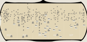
Live Music Mapping “examines the impact of shifts in the globalized music economy and national-level changes on localised cultural, social and economic actors from the perspective of cities and regions.” It visualizes music scenes – particularly active venues – in cities all over the world, with an emphasis on the UK.
Marvin Gaye Live
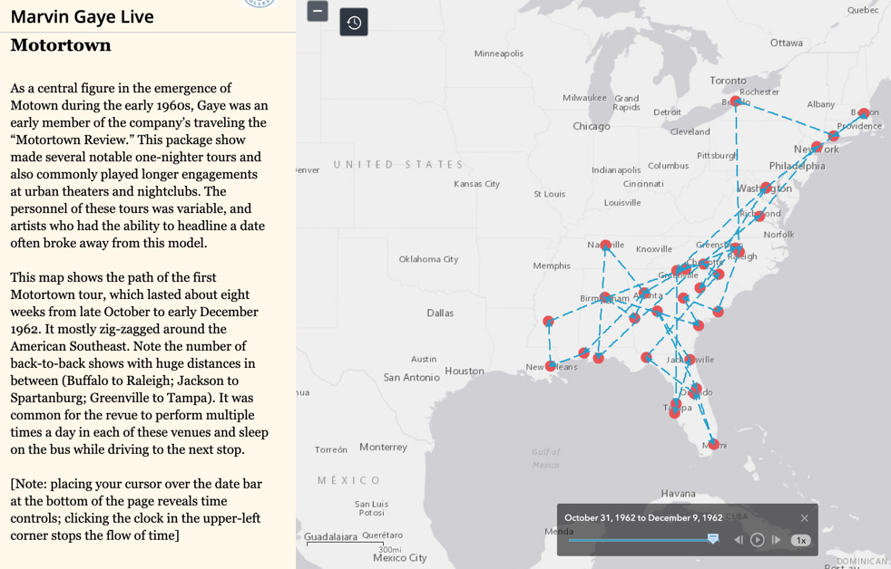
Produced by musicologist Andrew Flory and several teams of students at Carleton College, this project visualize Marvin Gaye’s performance career, which included over a thousand performances over twenty five years. The project contextualizes Gaye’s careers within the racial politics of segregation, as important for understanding his performances in the American North and West as in the South. Taking full advantage of the ability of ArcGIS Storymaps to present multiple maps, embed primary sources, and link to sound clips, Marvin Gaye Live serves as a model for the many ways in which maps can be used to illuminate new aspects of music history for an audience that includes scholars as well as the general public.
Sekuru’s Stories
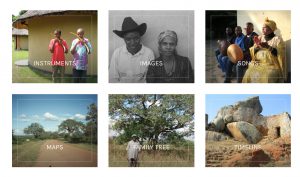
Sekuru’s Stories is a digital public humanities project featuring the renowned Zimbabwean mbira player, oral historian, and ritual specialist Sekuru Tute Chigamba. Bringing Sekuru Chigamba’s oral narratives, or nhoroondo, together with recordings, photographs, and maps, it presents Zimbabwean musical and cultural heritage in an interactive format. Use the top navigation menu to read through Sekuru’s Stories, or explore a variety of non-linear pathways through the site, including an instrument catalogue, image gallery, audio playlist, and more.
Virtual Paul’s Cross Project
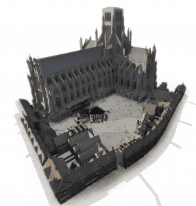
This project is an interactive way to experience a religious service at St. Paul’s Cathedral and St. Paul’s Churchyard in the early 17th century. The site is divided into audio and visual perspectives on the events, with historical context for certain sound effects such as the sound of dogs barking or horse hooves on cobblestones. The project has been installed in the Teaching and Visualization Lab at NC State, where the user can have an immersive experience based off of the visual and auditory models.
Troubadour Melodies
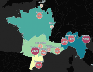
This Troubadour Melodies Database is a collection of melodies of the Troubadour Tradition that have been digitized by structure, rhythmic patterns, and supposed composer. The organization of this database is built on BEdt or the Bibliografia Elettronica dei Trovatori which catalogues the composers and origins of these melodies. There are options to sort by melody, or melodic structure or there is an interactive map that shows broad geographic areas pertaining to distinct traditions. The maps can be accessed under the resources tab through “Dissertation Resources.”
Repository of Digital Resources for Musicology
In addition to its own catalogue of sources, the Digital Resources in Musicology showcases “ADAM: Archive of Digital Applications in Musicology, EVE: Electronic and Virtual Editions, and Harvard’s Online Resources for Music Scholars.” The repository, which serves as a vast collection of ideas and information, aggregates study and research information for scholars. Within its categories, it provides links to GIS maps from different sources around the world – some of these maps show information from antiquity, while others include more modern information.
Music-Map
Music-Map is a networking map that demonstrates and classifies people’s musical tastes through graphical spacial relations. An innovative conceptual map, Music-Map uses clusters and distance to illustrate the degree of relativity between artists, thereby suggesting the likeliness of a shared audience. Though quite different from the projects involved in musical geography, Music-Map provides an opportunity to examine the nature of space by disengaging spatial reference from geocodes. This project inspires contemplation for the possibility to not only locate individual events, but also highlight the connections between them in our own maps.
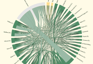
Musicians in Venice
This is a network map showing the connections of Giovanni Legrenzi to other musicians and locations in Venice from 1670 to 1690. The map seeks to show how interconnected Giovanni Legrenzi was with the Venetian music scene. The data is very thorough, and the popups are very informative of the interactions.
Music Diplomacy
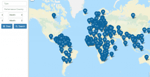
The U.S. State Department has sponsored a “Database of Cultural Presentations” map that shows locations of U.S. touring groups’ performances during the Cold War. You can search in several categories, like group name, performance city, performance type, and performance country.
Mapping Touring
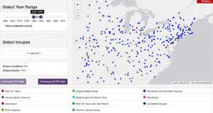
As part of a larger project called “Mapping Movement,” Harmony Bench and Kate Elswit’s “Mapping Touring” project seeks to visualize dance history through the domestic and international tours of ballet and modern dance companies during the 20th century. It displays data related to troupe, venue, date, works performed, and personnel in a searchable database, a map visualization of performances, and a map visualization of tour routes. On the performance map, you can select date ranges and specific troupes, allowing the viewer to follow one of the nine companies represented along their tour, or track overall performance patterns.
The Geography of America’s Pop Music/Entertainment Complex
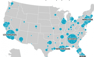
Richard Florida of the University of Toronto discusses the research that he and his team led to answer the question What does the geography of popular music look like? To do this, he and his team collected information from MySpace in 2007, to identify ten, specific popular genres and the number of plays or views each specific genre received. The proportional point maps portray the relative popularity of the specific musical genres in different general areas of the United States, causing the maps to be vague in terms of specific geographic locations. While visually engaging, the maps prevent access to the underlying data, prohibiting detailed data analysis.
The Geography of America’s Music Scenes
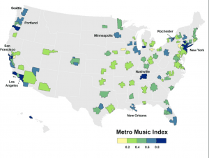
This static map shows one way to answer the question “where are America’s leading centers for musicians and the music industry?” Charlotta Mellander of Martin Property Institute combined data on musicians and recording industry business establishments via the Bureau of Labor Statistics and the U.S. Bureau of Economic Analysis, to create a Metro Music Index. This index provided map-able data ready for visualization. The higher the density, the higher the music index number, and darker the area on the map. As Richard Florida explains, this map not only shows density through clusters, but can provoke more questions about the influences and environments that made those clusters possible.
Dezède
This non-mapping digital humanities archive, created by musicologists at the Université de Rouen, acts as a repository of chronological performance data. The archive contains over 20,000 event records, which can be searched through topical dossiers or via various authority records such as performing organization, venue, composer, or date. It strikes a compelling balance between being authoritative and open-ended. Researchers can submit data to Dezède that they have compiled on their own in order to build the archive. The archive is rigorous in its citations; all of the data for each event record comes with clearly cited sources. Dezède flexible and designed for both research and pedagogical use.
The Roaring Twenties
This interactive website includes documentation of noise complaints in New York in the 1920s. The site, with excellent presentation and citing of information, includes separate tabs on the time, space, and sounds of this period of history. These sounds come from automobiles, loud neighbors, and immigrant communities.
Radiooooo
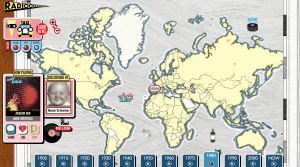
Radiooooo is an interactive map that provides the listener with a song from the crowd-sourced “radio,” using a specified country and decade after 1900. The map allows the listener to specify whether the song is slow, fast, or weird and then suprises them with a selection. The map’s focus on the 20th century music was chosen to show the diversification of musical taste after the invention of the radio. The site’s accessibility and its presentation should be especially appreciated — it is clearly appealing, and serves as a clear example of a resource useful for any audience. This map uses well what Bethany Nowviskie describes as “wise foolishness,” as it plays with the user, opening up the world of exploration in popular music throughout the 20th century.
Radio Garden
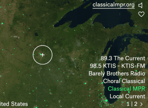
Radio Garden is produced by Studio Puckey and Moniker, both Amsterdam-based design studios. This interactive globe delivers radio transmissions from across the globe based on location. Notably, it streams many stations from Asia, South America, Africa, and Australia, and addresses cultures that may have been poorly documented and preserved throughout history. This source provides immediately meaningful visualizations of radio livestreams, even if they only can show radio stations with online presences.
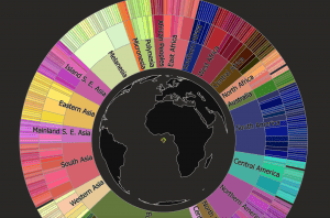
Musicmap
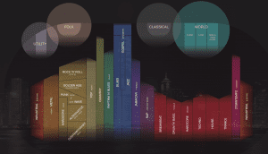
Musicmap is a visual genealogy that introduces the history of, and relationships between, popular music genres. The incorporation of database construction with verbal and multimedia elaboration not only builds the macroscopic frames of popular musical genres, but also highlights the ambiguity and inconsistency in regard to individual cases. In addition, effective visualizations such as color coding, gridding, and family tree symbols balance the complexity of the subject with accessibility for the users to capture the information. Musicmap is a good example of a digital humanities project that contributes to both public knowledge and professional studies.
Musical Passage
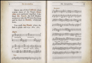
What’s different about this musical map from others is the very format of the “map” – not a geographical rendering of the dissemination of Jamaican music in the 17th century, but rather a mapping of sounds onto paper using Western-style notation practices. The sheet music becomes the base map for this site. The organization of this map privileges its auditory component; scan any part of the open, manuscript page and different songs are highlighted, with the option to “Explore” the particular instrumentation of that piece by opening another bubble. Users should also make use of the considerable textual support provided by the “About” and “Read” pages, which explain the researchers’ approach, as well as the context of this isolated musical incident.
Hip Hop Geography
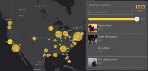
This project by Katya Deve situates the history of hip hop in particular times and places, starting in the South Bronx in 1973. Deve’s use of a map in representing and analyzing the history of this art form is highly appropriate, as hip hop is a highly geographically influenced musical genre. The time slider allows the viewer to navigate fluidly between the years of 1973 and 2016. The view transforms into a cluster map as yellow circles appear and expand across a map of the continental United States, representing over a thousand different notable hip hop artists and their hometowns. The user is able to click on individual artists and listen to a clip of one of their songs.
The Global Jukebox
The Global Jukebox is a project initiated by Columbia Univeristy musicologist, Alan Lomax. He created an interactive tool that allows users to see the similarities between folk song traditions around the world. The user can choose to navigate the Global Jukebox either through a spinning wheel, hence the “Jukebox” title, or grouped markers on a world map. A good starting point is the “Journeys” option which gives in-depth information about a certain topic along with musical examples. Due to the large and ambitious scope of this project, the Global Jukebox functions as a great introduction to folk music research.
Chatty Maps – Exploring How Your City Sounds
In maps made with Carto, MapBox, and OSM, researchers from Bell labs have created a Maps for the streets of the World’s major cities, and analyzed what kinds of noise are on that street (music, transportation, nature, etc). They have also included a chart of the emotions of each street – from happy to aniticipatory to angry and several emotions in between. To do this, they use sound clips and pictures from those places and create statistically “happy, musical” streets, or, in comparison, “angry transportation” streets. Their site is fairly easy to navigate and very organized, and their sources and publications are easy to find as well. While the site is accessible, you can’t zoom out at all and must pan the streets to see real change, rather than zooming out and being able to see it all at once. Looking into the “sensorial and emotional layers of cities” seems like something we could look into incorporating into our own maps. Since our maps are about history, and not the present with current technology, it would be difficult for us to gauge how happy a street would have been just through a picture or two, or even none at all.
Archive of Digitized Wax Cylinders
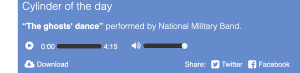
In 2002 the University of Santa Barbara began digitizing a collection of over 10,000 wax cylinders, the recording precursor to vinyl. This method was popular in the late 19th and early 20th centuries, which makes it a particularly useful resource for studying the recordings of that era. In addition to a database of recordings, there are curated playlists as well as articles on the historical background of wax cylinder recordings. There is also a Vernacular Wax Recordings Database which includes at-home recordings of American life from as early as 1890.
American Religious Sounds Project
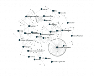
This project is a collaboration between Ohio State and Michigan State Universities to answer “what does religion in the United States sound like?” There are two main umbrella categories that allow the user visualized answers to this question: “gallery” and “explore”. The gallery gives users a more curated experience with pages organized by genre, event, denomination, etc. A few of these “exhibits” include “Mennonite Voices,” “Travel Ban Protest,” and “Mobile Ministry.” The explore page, on the other hand, includes three different platforms to display the project’s large amount of data. “Archives” shows a filterable table of all available recordings from across the U.S. “Connections” shows a filterable network map of relationships between recordings. Finally, the “Map” provides an interactive map that plots the field recordings geographically.
Other Humanities Models
16 Maps That Will Change How You See France
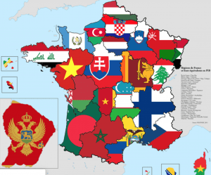
This BuzzFeed article promises to show you 16 maps that will “change how you see France,” and they deliver. From maps that display historical land losses and gains, to ancient maps drawn by monks, or how many kisses it is customary to give in each region, to the spread of the motorway system from 1940. These maps visualize the past and present political, social, and environmental changes in France. Since the page incorporates so many different types of maps (chronological, separated by region, etc.), it gives a well-rounded experience of France that once map alone could not accomplish.
Visualizing the Racial Divide
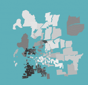
This map uses maps to visualize the racial divide in several US cities. The creator of this map used a certain technique, called force-directed mapping, to differentiate certain divides. The map takes racial demographic data from the 2010 census, and then creates links between neighboring sections of a city. If the demographic makeup of two neighborhoods is similar, they will hardly separate. If there are contrasting demographics, the city sections will separate drastically. This visualization is effective in that it shows how de facto segregation within cities is literally creating racial divides.
USGS Historical Maps
This map explorer, designed by the U.S. Geological Survey, overlays years worth of digitized historical topographic maps onto a neutral basemap of the United States. This map is very clear and user friendly ⎯ simply type in a U.S. location, and then click a place on the map to see what historic maps are available in the area. Once zoomed in at a city-level, the site provides a timeline of the historic maps produced around that location, some dating back to the late-1800s. Each map provided in the timeline is available to view and play with.
The Pompeii Bibliography and Mapping Project
The Pompeii Bibliography and Mapping Project uses writings about the ancient city to create a map that reflects the city’s original layout. Using ArcGIS, this project provides a new way to engage with detailed information provided by numerous publications on Pompeii. In addition to providing visualizations of all the data, the project makes all core data available for download and later use. The map’s layers provide illustrative details about the city’s design, including elevation points, building functions, and curbstone materials.
Pizza Place Geography
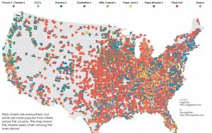
Statistician Nathan Yau’s Flowing Data site was introduced to us via a specific project: this map of pizza place geography in the United States. The map isn’t interactive, yet it communicates data extremely clearly, thanks to the side-by-side comparison of map layers shown underneath the main image. This project serves as a good reminder that interactivity, media-richness, and animations aren’t required to make an effective and engaging map. The rest of the Flowing Data website offers dozens of striking data visualizations, from animated maps showing the change in unemployment rate over time, to U.S. maps that compare the locations of firearm dealers versus popular food vendors.
Moving Bodies, Moving Culture
The maps on this research blog are intended both to support research on the dance touring practices by Kate Elswit (in her ongoing collaboration with Harmony Bench) and to inspire new research questions. The maps are “exploratory visualizations” of the American Ballet Caravan’s progress in 1941 South America. The bright lines, circles, and polygons overlaying highlight the possible connections between the dancers on the tour. The maps, and must-read surrounding research blog, bring up interesting questions about the intersections between individual dancers, the company, and the many places to and from which they travel.
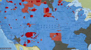
Monroe Work Today
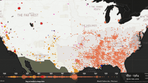
Named after the work of Monroe Nathan Work, this project maps every known lynching in American history carried out by a mob. Each marker on the map represents one incident, and each color represents a different racial/ethnic demographic. The map is accompanied by a timeline that ranges from the first known lynching in 1835 to 1964. You can easily drag over the timeline to change the range of dates presented in the map. The map of the U.S. itself is presented in generalized regions like “the Deep South” and “the Far West” for historical context. One especially unique feature of this map is the way that the bibliography is linked – for each data point, the source cited can be accessed on the website after one click.
Mapping the Whitney Biennial
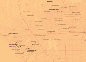
From 1932 to 1975, Annuals and Biennials held by the Whitney Museum of American Art recorded the street addresses of artists whose works were showcased. In 2019, the New York Times used this data to publish a series of static and maps, accompanied by prose, that shows geographically situated hot spots of artistic networks, power, and money across the U.S. Each map covers one of three major U.S. cities (New York City, Chicago, and Los Angeles), and is accompanied by a of its corresponding region. The NY Times also uses this project to discuss the change in the Biennial’s racial, geographic, and gender diversity.
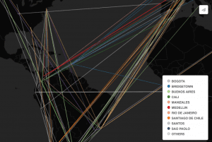
Mapping Arms Data
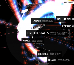
Prepare to be wowed by the graphics in this glowing map that tracks the trade in arms (weaponry) over a twenty-year span: 1992-2012. The timeline at the bottom of the page permits an easy view of change over time. Additionally, the globe at the center of the page can be manipulated to look at various points from different angles, and also click on different regions of the world. The colorcoded toolbar at the left corresponds to the volume of trade in dollars of various kinds of arms dealing (such as civilian weapons vs. ammunition) and uses a color for each kind of import/export.
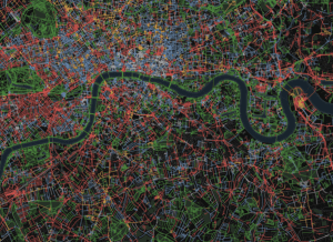
Map of Early Modern London
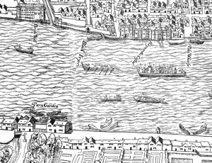
Created through a collaboration between professors of Oxford and Victoria University in England, this is a map of “Early Modern London” which outlines buildings and roads in color-coded categories based on location. Any combination of the categories may be shown on the map, and clicking specific venues produces pop-ups that provide information about the location. In addition, the location-based pop-up shows users which supplemental documents are related to the content being viewed, providing hyperlinks to other features on the site. The entire site is open-code, open-access, and open-source.
Lynching in America
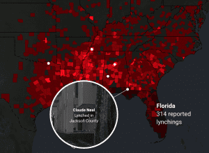
This project presents interecative maps, videos, and reports that engage with the history of lynchings in America. The map itself has two layers: the first shows the number of reported lynchings by county, and the second features the stories of victims, accompanied by video and text. A second map shows a racial breakdown of the U.S., by state, throughout the years of the Great Migration over a period of 60 years (1910-1970). It visualizes how the threats of racial violence affected the travel patterns of many African-Americans. All components of the “Lynching in America” website contribute to “the Report” ⎯ an online resource with additional research and educational materials.
Locating Lutheranism
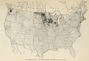
Locating Lutheranism, funded by St. Olaf College’s Digital Humanities on the Hill initiative, seeks to learn about Norwegian-American Lutheran populations in MN through mapping and analyzing the names, locations, and census information associated with historical and present-day Lutheran congregations. Student and faculty collaborators use WordPress and ArcGIS to display their data, and to focus on four particular Minnesota congregations that drew their attention. On their site, they include multiple maps to show different ideas. Their site shows clear purpose, data, process, and results. Additionally, you can use the search bar on their site to search for towns and keywords related to the Lutheran Church in Minnesota.
Invasion of America
Based on maps produced by the Bureau of American Ethnology in 1899, this interactive, time-sensitive map shows the expansion of United States territory from the late 18th through the late 19th century in terms of land taken from Native Americans, rather than empty land claimed by settlers (as most other maps of this process show.)
Gough Map of Medieval England
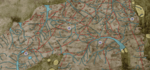
This website hosts a project titled “Linguistic Geographies” that seeks to understand how people in the Middle Ages created maps. Their website, similar to ours, shows a map and a blog. They focus on only one map, the Gough Map of Great Britain (believed to be one of the earliest maps “to show Britain in a geographically-recognizable form”). They include a search bar that allows the user to search by modern location or Middle Ages location name.
Digital Harrisburg
This project from Messiah College and Harrisburg University of Science and Technology is a model for using census data in conjunction with historical maps. With a 1901 Company Atlas, a team of students and faculty combed through 1900 Census Data for the Town of Harrisburg and joined that data with polygons for each residence. The map includes a search function for first and last name, as well as location.
Columbia Center for Spatial Research
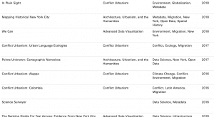
This particular website houses a number of projects which examine the applications of digital mapping to humanities research. A number of the featured projects focus on world conflicts (management and history) with provided summaries and links to each project site. This is a very detailed website, and provides a diverse assortment of sources for future research as well as being an exhibition of research conducted at Columbia University. The most helpful tabs for the semi-casual visitor are “About” and “Projects,” but it’s also worth the time to explore current projects or research within the digital spatial humanities via the “News” and “Publications” tabs.
CityLab Maps
CityLab is an editorial website based in D.C. that focuses its coverage on the central aspects of urban living. These aspects include design, transportation, environment, equity, and life. In addition to articles, the website hosts a variety of interactive digital maps to accompany story content. These maps visualize a wide array of data, including “Where America’s Renters Want to Move Next,” “Mapping Where Traffic Pollution Hurts Children Most,” and “The Suburbanization of American Arrests.” Each map is accompanied by an article that explains its context and relevance to urban life.
The Atlas of Early Printing
This creation of the University of Iowa provides intuitive interactive mapping through chronological, animated layers that show the spread of printing, paper mills, and other related subjects. Their pop-ups include links to the library’s site to find primary sources.
Artists in Paris: Mapping the 18th-Century Art World
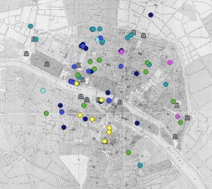
Artists in Paris is an open-access digital humanities and art history project that maps hundreds of 18th-century artists’ homes and studios. This website’s database contains an entry for 471 artists. While it’s possible to search by artist name, drawing on personal knowledge of French 18th-century painters and sculptors, there is a handy Guide section that explains how to get the most out of the resource. Perhaps the easiest way to start using Artists in Paris is to filter by year, which produces color-coded markers on the map indicating addresses where artists lived. The color of the marker indicates the type of artist, such as history painter, engraver, or landscapist.
You must be logged in to post a comment.