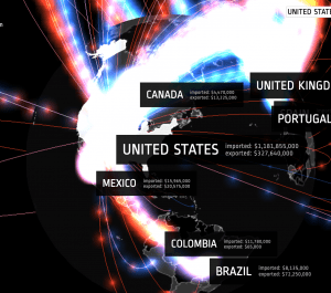
Prepare to be wowed by the graphics in this glowing map that tracks the trade in arms (weaponry) over a twenty-year span: 1992-2012. The timeline at the bottom of the page permits an easy view of change over time. Additionally, the globe at the center of the page can be manipulated to look at various points from different angles, and also click on different regions of the world. The colorcoded toolbar at the left corresponds to the volume of trade in dollars of various kinds of arms dealing (such as civilian weapons vs. ammunition) and uses a color for each kind of import/export.
You must be logged in to post a comment.