How To
Interested in a more in-depth explanation? Check out our downloadable textbook The Musical Geography Research and Style Guide.
This page explains how we made our digital maps from developing research questions, to collecting data, and building the maps themselves.
If you’re reading this, you’re either interested in using digitized newspapers to make interactive digital maps or you’re being forced to use digitized newspapers to make interactive digital maps. Either way, welcome! This guide exists to help make sense of the wealth of digitized resources available and to translate their riches into effective maps. The idea is to take a process that can feel daunting and overwhelming and make it feel straightforward and manageable. By the time you’ve finished reading this guide, you’ll be an expert at working with historical newspapers and with the databases that compile them. You’ll also be prepared to use the historical data you’ve collected to make interactive digital maps.
This guide is broken into two parts. The first section discusses how to use digitized newspapers for musicological research, while the second section is about how to create digital maps.
If you are interested in learning how to use ArcGIS, jump to our page on Tips and Tricks for ArcGIS.
Do you prefer learning via video? Check out our video tutorials on Digital Newspaper Research and Map-Making.
How to Begin Your Digital Map Research Project
1. Developing a Research Question
All research projects start with a broad, overarching topic. Usually, this topic is too broad to create a nuanced research project. The key therefore is narrowing down your topic to a specific subtopic that is approachable, engaging, and representative of the questions posed by your larger topic. Good digital maps are born out of specific research questions with both geographical and chronological limitations.
The first step of any map-oriented research project is developing a research question. A good research question is specific: what music was performed at Frederick Douglass’s speeches? Where did touring Fisk Jubilee Singers ensembles perform between 1885 and 1895?
But good research questions also leave room for adjustment, and expansion. Maybe Frederick Douglass rarely spoke at events where music was also heard; let’s try adding Booker T. Washington to our research question. And maybe the Fisk Jubilee Singers only toured in the late 1880s, but we learn they started touring in 1867 and continue touring in the present. Is it too ambitious to try to map all of their tours? Maybe it is. Similarly, attempting to map all performances of indigenous song collection during the twentieth century is too broad, yet looking at the song collections of a specific tribe or First Nation during a set time period is both a wiser place to start and a strategy that leaves room open for expansion later down the road.
Is Your Research Question Mappable? What Types of Data Work Well with Maps?
Since this guide is focused on digital mapping, it is important to consider what types of data work well with maps. As you begin developing your research question, consider:
Does my research produce data that is geographically disparate?
Maybe you’re interested in performances at a famous theater. Your map is going to show a single point – that’s not so interesting. Try a timeline, video, essay, or podcast.
Does my research produce data that is meaningful when it’s visualized on a map?
Maybe you’re thinking it’d be neat to see where symphonies were composed in 1933. But then you realize that Aaron Copland and Arthur Honegger moved around during that year. Florence Price’s Symphony No. 1 was premiered in 1933, but composed earlier in a different place. And while a map drawing together lots of symphony-related places might be an interesting way into the topic, the map itself won’t make an argument; it will serve as a portal for users to access information. That can be a useful service for a map to provide, but you might just as easily use a timeline, video, essay, or podcast to the same end.
On the other hand, if your answer to these questions is “yes,” then a map might be right for you.
A standard historical research paper asks you to make an argument using various primary sources. Digital maps interpret primary source material in a geographical context. They force us to consider the relationships between place and historical sources. Good research questions visualize change over time, relationships between origins and destinations, and compare and contrast geographical patterns.
2. Acknowledging/Identifying Limitations of Your Project Before You Begin
Before you begin primary source research, it is important to decide on the limitations of your project. Factoring into account how much time you have and want to give to this project, place limitations on your research. Carefully focused research on a specific sub-topic is more effective than broad-based, general inquiry.
Consider the extent of your research questions. Do you want to focus on a single person, or organization? There are no right answers to these questions. Your answer will depend on your own circumstances, research interests, and time limitations. If you’re not sure, try some preliminary keyword searching in primary source databases to determine the amount of source material available.
The first limitation to consider is time: What specific time period do you want to focus on. Decide on a clear timeframe for your research and map within those parameters. It is unrealistic to map one hundred years worth of data, but more plausible to map a single year, a single city, or a limited number of decades. The time limitations of your research question will largely depend on how much time and resources you wish to spend on the project. Keep in mind that you often will need a smaller timeframe than you think. In many cases, limiting your research question to one year can easily produce 200+ data points. For a small to medium sized project, I recommend limiting your data to a maximum of a five year time period. You can collect data in a consecutive range, or from a sampling of years. For example, you could collect data from 1880-85, or you could collect data from 1867, 1877, and 1877.
The second factor to consider is the geographic limitations of your project. Do you want to include international data? Are you going to focus on a single city, or a single region? Consider, what is the geographic base of your data? Are you collecting data based off of cities, addresses, states, countries? Depending on your subject, it is okay if you don’t have the precise location for every point. Consider the scale on which your map will be viewed. If you are collecting data about a single city, having an exact address for every point is crucial for the layout of your map. However, if you are collecting data within a state, region, or country, it is okay if you don’t have an exact address for every data point.
Recognize the more limited your scope the more effective your scholarship. For example, mapping every performance by black minstrel troupes between 1865-1900 is an insurmountable task. Instead, mapping tours of three troupes in two different seasons is more approachable and likely to make a more riveting scholarly argument. Focusing on one or two seasons allows you to engage deeply with a smaller set of source material and consequently raise more sophisticated scholarly arguments. It allows you to consider: How did the geographic scope of minstrel troupe tours change in the latter half of the nineteenth century? How did minstrel performance interact and overlap with other types of entertainment? What can ticket prices reveal about economic demographics of minstrel audiences in the nineteenth century? Limited scope gives you a window to reflect on larger scholarly questions in a way that is meaningful and thoroughly engages with the source material.
Using Digitized Newspapers for Historical Research
Once you have identified a specific research question, how do you begin collecting data from primary sources?
While you may be able to draw data from secondary sources or archival collections, many times digitized historical newspapers will be the best data source for your topic. Furthermore, if you are still searching for the right research question, tailored and strategic newspaper searching can lead you to the right sub-topic. It is okay if your research question is still fuzzy as you begin the newspaper research process!
Best Practices for Using Historical Newspapers: Towards a Research Methodology
Digital newspapers are a fantastic resource for historical research.This section will outline best practices for working with digitized historical newspapers. How can researchers and students use digitized newspapers to their advantage? And, what challenges do digitized newspapers create?
To begin, which newspaper database should you use? Which database you search first will depend on the chronological and geographical parameters of your project. Generally speaking, search a large database first and then look at smaller, regional databases. The goal of your initial search should be to discern: Is there enough material about this topic to warrant further investigation? You may find there is too much material, in which you will need to further refine your search terms.
The table below provides a quick reference guide to major digitized newspaper databases for American newspapers from the eighteenth, nineteenth, and twentieth centuries.
Pros and Cons of Major Digitized Newspaper Collections
Stage I: Exploration
How to Search and Read Digitized Newspapers
Once you have selected a database, it is time to begin searching. Initial searching is known as the exploration phase. The goal of this phase is to figure out: What is interesting? What do I want to read more thoroughly about? Think of the exploratory phase as a gateway to sustained reading.
Digitized key-word searches rely on Optical Character Recognition (often abbreviated OCR). While OCR is a powerful tool that allows historians to sort through large volumes of data, it is also an imperfect tool.
If you are searching for an exact phrase, put the term in quotes. Be aware that historical newspapers often have a somewhat cavalier attitude towards names; multiple spellings and misspellings of names are normal. If a word or name has multiple known spellings, put both spellings in quotes separated with “or.”
While searching in the Brooklyn Digitized Newspaper archive for just “Camilla Urso” returned 131 results, adding the alternate spelling “Camille Urso” returned an additional 20 results. Also try searching for word truncations such as “Camil* Urso.”
Newspaper search algorithms work best with broad but specific results. In the example above, while I have specified an exact name in quotes, I have also made my search broad enough to encompass multiple spellings and misspellings.
How do you know if you have found a good set of keywords?
Good keywords are:
-Mappable (involve a geographical element)
-Significant amount of results (at least 200-500 results for a small project)
-Intriguing
-Fill a gap in existing scholarship
-What do I want to know more about?
Stage II: Topic Based Reading & Stage III: Data Collection
One you have a good set of keywords, you are ready to move onto more systematic newspaper reading, either topic based reading, data collection, or both.
Topic based reading is reading systematically in order to learn more about a specific topic, and discover primary source quotations. Data collection involves reading large amounts of newspapers in a organized way in order to collect data on a specific topic (usually for mapping purposes). Depending on your research question, you may need to do both topic based reading and data collection. If you plan to make a map, then data collection is required. If you plan to use newspaper quotes in a research paper or other medium, than topic based reading is more appropriate for you.
How do you read systematically and extract data from digitized newspapers?
Digitized newspapers return thousands of results with one click, however, browsing results too quickly can easily lead to misconstrued data. I recommend sorting your search results chronologically, this facilitates narrative reading and helps contextualize articles within a larger research narrative. When reading through search results, the most important thing is not to cherry pick. Regardless of how you sort your data, read all the search-results on a page. Do not rely on text previews or OCR to determine whether or not to view a result. When reading through results, it can be helpful to set aside or flag detailed articles that you may want to come back to, transcribe, or quote in the future. Setting them aside in a new tab, allows you to continue browsing without becoming sidetracked by a single article.
The Importance of Contextual Reading
Secondly, always look for context in a newspaper keyword result. Some databases facilitate contextual reading better than others. If the database automatically clips text into columns, click to view the whole page. As you read, ask yourself: What section of the newspaper is this in? How does the graphics, text, and size compare to the adjacent articles, columns, advertisements on the page? Where is the paper is this result located? Is it a front page story with a large heading, or is it hidden in a back page classified section?
How Many Databases Should You Search?
Contextualized searching also means never rely solely on one digitized newspaper archive. Every digitized collection contains a different set of papers and works slightly differently. Relying on one digitized archive means your data is more likely to contain blindspots, be incomplete or asymmetric. Depending on the scope and scale of your research you can consult three digitized collections or fifteen digitized collections. For a small or medium sized project, a good practice is to consult two national databases and one regional or state database.
Treat Your Findings Like Data: How to Read Efficiently
While you read through search results, treat your findings like data. Know which data points are important, and which you can disregard. Not every keyword result will be helpful. Work to strike a balance between reading for depth and context, and reading with data-driven efficiency. The more familiar you become with digitized newspapers, and the more you learn about your research topic, the easier it will be to discern which results are helpful. As you collect data, make sure to track which database you found a particular result in with a full citation and link. This not only increases the academic credibility of your work but also ensures you can easily trace your footsteps back to the original source if needed. It can be helpful to keep a separate document or spreadsheet to track longer articles that provide good source quotes or results you know you’ll want to revisit again. Some researchers prefer transcribing extended quotations, but simply tracking the title, paper, date, with a link to the original article is also sufficient.
How many data points do you need for a digital mapping project?
I recommend using the following guidelines:
50-100 data points for a small project
300-500 data points for a medium project
1000+ data points for a large project
Towards a Representative Dataset: Limitations of Digitized Research
Finally, recognize that digitized newspaper archives are incomplete. You can’t search for everything, and that should never be your intention. Using digitized sources with conscientious research practices and diligence creates representative, but always incomplete and imperfect, data. If you want to do a more thorough search, consider contacting local historical societies that might have archives of local historical newspapers. Historians and librarians are often happy to talk on the phone and look something up on your behalf!
For more information on the basics of digitized newspaper searching, please see my video tutorial on the Basics of Digitized Newspaper Searching.
Stage IV: Transcription
The final stage of newspaper research is transcription. Transcription is not required for map-making, but if you intend to write about your subject in any manner transcription is highly recommended. As you read newspaper results, you should have set aside any interesting or longer articles into a seperate window.
Set up a transcription spreadsheet to track the date, location, quotation, keywords, and citation for each source. I also recommend including a proxied link so you can revisit the source material if necessary.
How many quotations do you need to transcribe?
I recommend using the following guidelines:
20-30 quotations for a small project
30-50 quotations for a medium project
100+ quotations for a large project
Want to watch the newspaper transcription process unfold in real time? See my video tutorial on data cleaning and newspaper transcription.
The Four Stages of Newspaper Research
Working with digitized newspapers can be overwhelming. That’s why I’ve synthesized my research methodology into a one page flowchart outlining the Four Stages of Newspaper Research.
Feel free to download the attached handout and use it as a reference guide as you begin working with digitized newspapers.

Data Cleaning: How to Turn Your Data into a Map
Mapping Preparation: Cleaning Up Your Data
Before you move onto map-making you need to make sure your data is standardized. This process is known as data cleaning or data prep. A standardized data set ensures your data will show up on your map and you won’t run into unnecessary hurdles in later stages. An effective map starts from a clean and standardized database. Data cleaning is important because no one wants to go back and re-do their database once they’ve already moved into the mapping stage.
See our video tutorial on Preparing to Make a Map: Data Cleaning and Transcription
If your data involves specific dates consider: Does my dataset use a standardized date format? Either MM-DD-YYYY or YYYY/MM/DD or some variation. If not, you can easily fix this in google sheets by clicking format → number → More formats → More date and time formats → click the format you want and hit apply.
If your data utilizes repeated words such as places, names, or pieces of music make sure every iteration of that word has the exact same spelling (including accents, dashes, spacing, and capitalization). A mapping software will read irregularities between terms as separate items, creating unnecessary categories in your map.
Use Control+F to find similar pieces of data (addresses, names, venues, institutions, etc.) and ensure that they’re all entered correctly. Note that you shouldn’t use the entire term (“Theatre des Champs-Elysees”) because if there’s a typo in one entry, then it won’t be found. Rather, use what seems like a unique part of the name (“Elys”) to check on the rest of the name. If you find multiple spellings, use the find and replace feature to standardize. Besides for spelling irregularities, check for extra spaces, differing uses of punctuation, accent marks, etc…
When possible, each column in your data set should represent one variable. Mapping softwares work best when they can easily identify the function of every column. Separate cities and states into separate columns, and put longitude and latitude in separate columns. If your dataset includes pieces of music, separate the composer and piece name into separate columns. You can easily divide data using the text to column feature in google sheet or excel (data → split text to columns). If you haven’t already added geographical coordinates to your dataset, do it now. I would recommend including both the place name (city/state, or address) and geographical coordinates (lat/long) in your dataset.
Lastly consider the structure of your database: What is the purpose of each column in your data set? Do you want to include any further classification in your database? It is important to understand that the structure of your database directly correlates to the visual presentation of your map. If you want to color code and filter by performances of a specific composer, you will need a separate column for composers. Adding classification to your data can be extremely beneficial at this point. You may want to classify your data by type of concert, type of repertoire, type of event, etc… Classifying your data allows for easy filtering once you begin making your map.
Considering Copyright
As you begin to approach the map-making stage, it is time to consider copyright and citation issues. Firstly, does every line in your dataset link to a citation? Researchers in the humanities and social sciences cite according to the Chicago Manual of Style. If you want to use a different citation style you can, but make sure your citations are consistent. Choose one style and stick to it.
Secondly, if you intend to use any images or media in your map, make sure the works are public domain or you have obtained usage rights. Any image you use, including public domain images, should have a full citation. If you intend to use any images from archival collections, especially digitized archival collections, make sure you have permission to use the images. Do not assume media is public domain. If you are unsure, email the archival collection or respective body, state how you intend to use the images in questions and ask about their image reproduction policies. Copyright questions also apply to any custom basemaps used in your map. Make sure the map is public domain, and you’ve included a full citation.
Data cleaning can be a frustrating process, that’s why I’ve condensed the data cleaning process into a one-page flowchart called “Are You Ready to Make a Map?” As you clean your data, use this flowchart as an quick reference guide.

How Do You Make a Digital Map?
Start by Working Backwards
Before you begin making a map, think back to your research question(s). What is your map trying to show, argue, offer access to? The answer will help you decide how to organize your data, how to visualize it, and how to contextualize it. You’ll need to ask other questions, too. As a test, choose 5-10 pieces of data and hand-draw a very rough map that includes a mock-up of how the data will look. When a user clicks on a marker or an area, what will they see in the resulting pop-up window? Do you want to embed media into your map? If you plan on presenting your data in layers, what would ideally be included in each layer? Keep in mind that you don’t need to limit yourself to a single map. You may find your data requires several different maps each with a different focus and argument. After answering these questions, you’ll be able to approach the next few steps of the process with a clearer sense of purpose and design.
Which Mapping Software Should You Use
Luckily, the emerging prevalence and popularity of digital humanities means you have multiple options. Read through the following table and decide which software makes the most sense for you. Look back at the paper mock-up you made, if you visualized a complex map with intricate pop-ups/tooltips, and multiple time sliders or color gradients, ArcGIS might be the right tool for your project! If you don’t have access to ArcGIS, try using QGIS or Tableau. QGIS has complex mapping skills similar to ArcGIS, but Tableau is more web-friendly and easily shareable. If you are just starting out with digital maps and want to put together a simple project, Palladio or StoryMap JS might be the right tool for you!
Pros and Cons of Major Digital Mapping Softwares
Once you have decided which software to use, you need to consider what makes a map effective. Good maps have a clear purpose. They synthesize large, complex datasets into a clear visual argument. A good map is nuanced, but not overly complex. The argument your map makes should be clear with a little explanation. Maps with too many symbols, or legends can be confusing to a reader. Therefore, as you begin the map-making process remember it is okay to make more than one map. In fact, your dataset probably requires more than one map – each with its own specific sub focus.
Maps as Arguments
Most maps make arguments. Consider: What argument does my data make? Your argument may not be clear until you visualize your data into a preliminary map. You may find your data doesn’t make an argument. If that is the case, you will need to consider why and decide whether you need to refine the focus of your map or of your dataset. Just as an essay, a podcast, or a video can present an argument – a map can also present an argument. Show your map to a friend or colleague and explain your argument. Is your argument clear? Is it easily understandable? Is it comprehensible by a third party with little to no background knowledge in your topic?
Does your initial data visualization look different than you expected? What design and style choices can you make that highlight your argument? That could mean coloring your map by year or type of event, or adding a base-map, or adding a time-slider. What do you want viewers to take away from your map? And, how can you make your argument clear to the reader through stylistic choices?
Maybe your map is not as engaging as you thought it would be. If so, that’s okay, you may need to redefine your research question. Data that is unexciting, or difficult to trace is likely a sign that you need a different set of research questions. Preliminary mapping is a good way to check in. Am I on the right track? Does my data look different than I expected on a map? What geographic patterns do you notice in your map? Do you want to modify your map or dataset now? You may find you need to collect new data or reevaluate your source material.
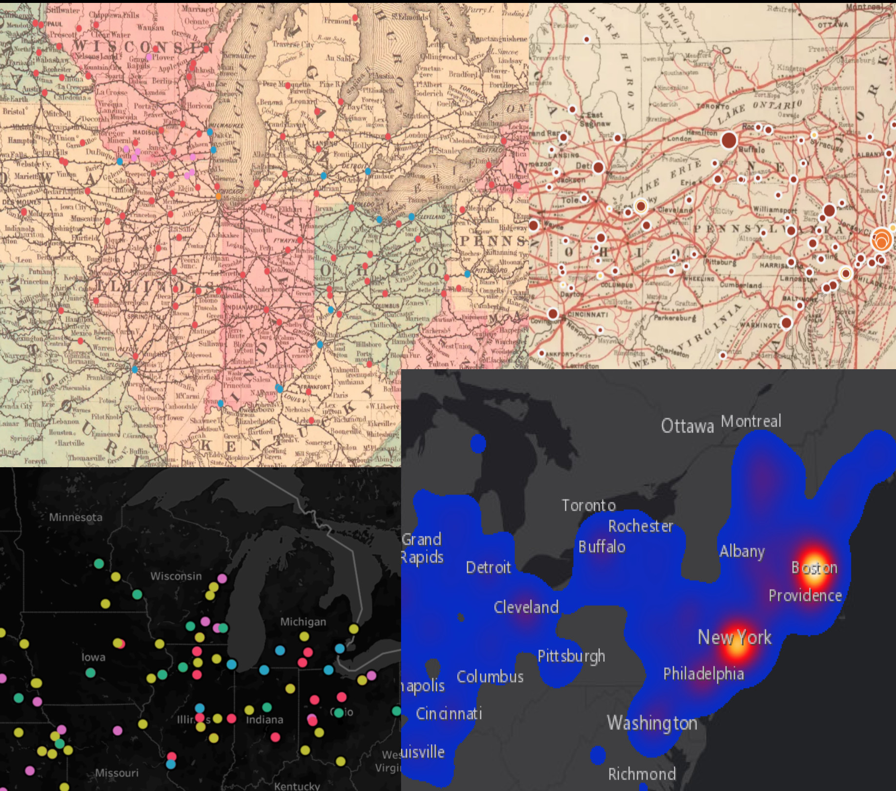
Furthermore, it is important to understand that maps are a subjective interpretation of a dataset. As Mark Monmonier argues in his book How To Lie With Maps, “a simple map is but one of an indefinitely large number of maps that might be produced for the same situation or from the same data.” Make multiple maps from your data. How are the maps different? In what ways do your cartographic choices create bias?
For example, the four maps below all come from the same dataset, yet look vastly different and make different arguments.
From left to right:
Upper left: visualizes data onto a historical railroad map colored by event type. (This is also an example of poor design principles)
Upper right: visualizes data onto a historical railroad map, sized by frequency, and colored by event type with a color ramp
Lower right: A heat map of data by frequency
Lower left: A small subset of data (ten years only) colored by year
Considering the Viewer Experience
As you begin designing your map you will need to consider design principles. While your dataset may be large or complex, maps with too many symbols, legends, or color schemes can easily overwhelm or confuse viewers. Consider the experience of a viewer looking at your map for the first time. Your map should strike a balance between being exploratory without being overwhelming. If you want to convey multiple facets of your dataset, making multiple maps might be the best way to convey complex information in an accessible manner. When at all possible try and make accessible design choices. Allow for custom scaling, and customizable basemaps in case viewers have different accessibility needs.
When a user clicks on a marker or an area, what will they see in the resulting pop-up window? Do you want to embed media into your map? If you plan on presenting your data in layers, what would ideally be included in each layer? Keep in mind that you don’t need to limit yourself to a single map.
Good maps have a clear purpose. They synthesize large, complex datasets into a clear visual argument. A good map is nuanced, but not overly complex. The argument your map makes should be clear with a little explanation. Maps with too many symbols, or legends can be confusing to a reader. Therefore always try and strike a balance between nuance and accessibility.
How do you transform your data into a map? Want to see the map-making process unfold in real time? Check out our video tutorial on Transforming Your Data Into a Map.
Interested in the nitty-gritty details on how to use ArcGIS? Jump to ArcGIS Tips and Tricks.
Ensuring Digital Longevity: Is Digital Work Really Permanent?
Digital projects tend to be imbued with a false sense of permanence. It is easy to think digital projects will be available forever. The reality, of course, is more complex. As our collective digital landscape and the software it is built on continually evolves, broken links become inevitable. Consider your future intentions for your project? If you want your project to remain accessible, regular maintenance to the site and project is essential. Too many good digital humanities projects are inaccessible due out of date software or broken links. Case in point see Digital Harlem, or The Roaring Twenties.
Conclusion
Congratulations, you’ve finished reading the guide. Hopefully you now feel equipped to make your own maps and experiment with digitized newspaper research. In the end this guide is a starting point. Digital research projects require individual trial and error. You will make mistakes. Your map won’t turn out how you intended or you will need to re-do your data structure. While digital maps help us make new scholarly arguments, they also make us better historians, musicologists, and students in the the process.
Authors Note
This guide was written by Maeve Nagel-Frazel under the supervision of Professor Louis Epstein during the summer and fall of 2021. Previous work on this guide was started by members of the Musical Geography Project from 2015-2019.