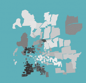
This map uses maps to visualize the racial divide in several US cities. The creator of this map used a certain technique, called force-directed mapping, to differentiate certain divides. The map takes racial demographic data from the 2010 census, and then creates links between neighboring sections of a city. If the demographic makeup of two neighborhoods is similar, they will hardly separate. If there are contrasting demographics, the city sections will separate drastically. This visualization is effective in that it shows how de facto segregation within cities is literally creating racial divides.
You must be logged in to post a comment.