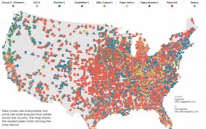
Statistician Nathan Yau’s Flowing Data site was introduced to us via a specific project: this map of pizza place geography in the United States. The map isn’t interactive, yet it communicates data extremely clearly, thanks to the side-by-side comparison of map layers shown underneath the main image. This project serves as a good reminder that interactivity, media-richness, and animations aren’t required to make an effective and engaging map. The rest of the Flowing Data website offers dozens of striking data visualizations, from animated maps showing the change in unemployment rate over time, to U.S. maps that compare the locations of firearm dealers versus popular food vendors.
You must be logged in to post a comment.