Mapping Milhaud’s Reception
Why Maps?
As a scholarly exercise in the Digital Humanities, our project mapping different aspects of the works and life of Darius Milhaud strives to explore the intersections of space, time, and sound through mapping technology. In combining musicological research with GIS, we are able to examine data sets in a unique way and share our findings with others online. Cathy Davidson says in her book Why Yack needs Hack- From Digital Humanities to Digital Literacy, “Digital humanities is the embodiment and communication of ideas online” (133). Embracing this ideology, we have created a series of maps that are fully accessible online and present musicological data in a new and exciting way.
The concept of musical mapping was fairly new to my colleagues and at the beginning of our work. In reading the scholarship of Bethany Nowviskie and Mark Monmonier, we established a set of guidelines for our maps. We embraced Bethany Nowviskie’s suggestion put forth in her work How to Play with Maps, that digital humanists reclaim map-making’s ludic qualities. Doing so allowed us to constantly ask the question “what if”. Employing this in our methodology enabled us to use our data creatively to create maps and explore innovative ways of communicating our findings with others.
What kind of maps to make?
The first question geographers must ask is “What type of map should I make?” While searching for the map that will most effectively convey the knowledge we’ve gathered, we must consider three options:
Data-Focused Map
A data-focused medium is useful when one needs to present a large amount of information. For example, our map of all of Milhaud’s performances contained over 500 data points. Within each point is contained information about the date, performing forces, venue, description, citation, and more. In order to present such information, we decided that the pop-up tools available on Arc GIS’s mapping platform would provide a useful tool when presenting this map. Luckily, Arc GIS software contains many features, including a feature that allows you to layer information on to one map with different color coded points. When exploring large data-sets, having one succinct viewing platform in which you can access a wealth of different information and display that information is different ways is invaluable. This type of data-focused map was the ideal candidate to showcase the information we compiled in our database. We have created several data-focused maps that can be found in our map gallery.
To be truly effective, however, it is necessary to format maps in the correct way. The Arc GIS mapping software has lots of little quirks that need to be ironed out in order to produce an effective map. There are two options when embedding a map into a website. One can use a web map or a web map application. A web map only displays the bare bones of the data set that one is trying to collect. Users are unable to toggle between layers or see a legend. In a web mapping application, however, both of these things are possible. Open the boxes below to see a comparison of a web map and a web mapping application and further analysis of these maps as they apply to Darius Milhaud.
Performances by Genre Web Map
This map, while it displays all of the same data points as its application counterpart, doesn’t allow for easy analysis. From this map, it is impossible to tell which marker corresponds to which genre, and beyond that, it is impossible to toggle between layers to see how the map shifts when only certain data sets are displayed.
Performances by Genre Web Mapping Application
This map allows for a much deeper analysis of trends. From this map, we are able to determine that Milhaud’s most frequently performed works were his orchestral works. In using the layers function, a user can select to view only certain genres. Having a legend on the map allows users to understand what it is they’re seeing. We can also see that Milhaud’s Chamber Music was the genre that had the furthest reach geographically. Milhaud’s chamber music was even played in the USSR. What can this trend tell us about musical tastes of the period? To have such a far reach geographically, Milhaud’s chamber music was played by several different chamber groups (Pro Arte Quartet, Kolisch Quartet). How does his connection to these various groups and their subsequent performance of his music relate to the changes relationships between performers and composers from the period?
What does this map tell us about Milhaud?
Several interesting patterns and questions arise from this research. First of all, why did these ten pieces yield the most performances in our research? And why are most of them stage or theater works? Does this suggest that Milhaud’s work was best received alongside a visual component?
The map itself also reveals some interesting trends. Right away it is clear that Milhaud’s work was performed in a very wide variety of cities, especially in Northern Europe. This map seems to suggest that the scope of Milhaud’s music stretched far beyond the boundaries of the French border. Whether this was as a result of the music’s popularity abroad, or of self-promotion, is a research question that may be worth pursuing from this map.
Some piece-specific trends bring us to other questions. For instance, there are no performances of Les Choëphores that appear outside of Paris, Brussels, and Antwerp. There are also eighteen performances of Salade in Paris, compared to only five outside of Paris. For the other eight pieces, the performances spread much farther outside of France. Why didn’t these two pieces spread further beyond the French border? Were they received less warmly abroad than others? Or was this simply a hole in our research? The map also shows that Le Pauvre Matelot was the most widespread of all the pieces on the map. So, was it the most popular abroad, or did Milhaud push to have it performed the most? In addition, a comparison of the reach of Milhaud’s ballets Salade, Le Train Bleu, and L’Homme et son desir demonstrates that each work was performed in completely different places outside of Paris. This means that the three ballet troupes that premiered and toured the works, Les Soirees de Paris, the Ballets Russes, and the Ballets Suedois, must have had unique touring and performing history even though each company was incredibly similar in structure. These questions and conclusions show how maps can emphasize new patterns and lead to new scholarship.
Why Data-Focused Maps?
Data-focused maps are useful tools when analyzing a large amount of data. As evidenced by the series of maps presented above, data-focused maps can take various forms and present a massive data sets in a way that is clear and easy to understand. Web mapping applications allow users a unique experience that can result in high-level data analysis that yields fascinating research opportunity. Data-focused maps, while particularly useful, are only one type of map that we used to present information about Darius Milhaud.
Narrative Maps
An additional type of map revolves around storytelling. Narrative maps’ primary purpose is to guide the user through a curated experience that tells a specific story.
Story Maps
One feature offered by Arc GIS that does this particularly well is the Story Maps feature. This allows geographers to curate a more specific experience regarding consumption of their data. Examples of such a maps can be found in our maps of Milhaud’s tours to the United States. The user is guided chronologically through Milhaud’s footsteps on the map by clicking arrows that move along the path of his tour. Story Maps are useful for creating a highly interactive, yet selective, experience for the map user. Enjoy exploring the maps below following in the footsteps of Milhaud’s first and second US tour.
Map of Milhaud's 1st US Tour
Map of Milhaud's 2nd US Tour
Animated Maps
Animated maps provide the user with the ability to watch the progression of data over time. Below examine two examples of different chronological animated maps. Expand the toggle box to read more about the two animated maps we’ve created and what they can tell us about Darius Milhaud.
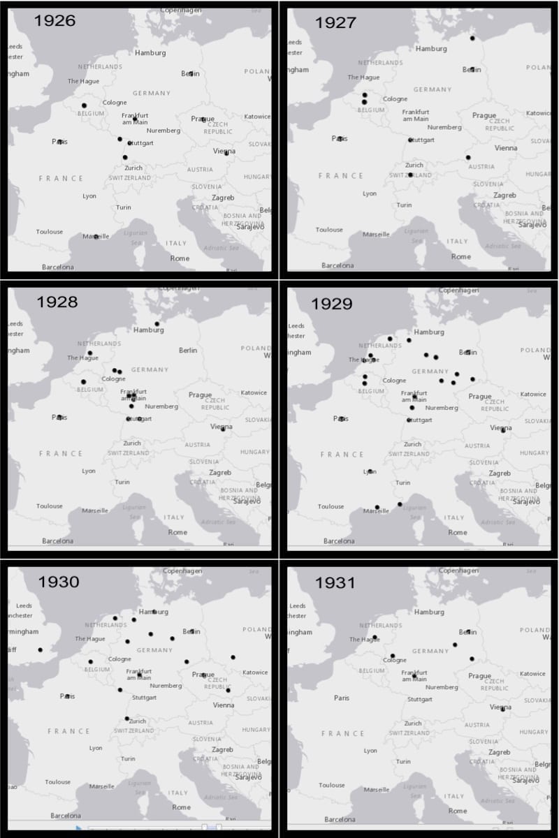
Chronological Map of Milhaud's Performances
The addition of a chronological function allows us to more deeply examine trends that we see developing over time. Using this function, one can clearly see an Eastern shift in performances of Milhaud from 1926-1931. What does this Eastern shift tell us? It confirms that Milhaud, an intensely French composer, was often performed in countries outside of France. It also lends credibility to the idea that Milhaud’s popularity in other European countries (specifically Germany) helped contribute to his rising success in France.
Chronological Map of Milhaud's Travels vs. Performances
What does this tell us about Milhaud?
This map raising many interesting questions about the impact of Milhaud’s travels on subsequent performances of his works, as well as the impact of performances of his work on Milhaud’s travel itineraries. We have collected information about Milhaud’s two United States Tours, his tour to the U.S.S.R, and his honeymoon. Milhaud’s honeymoon seems to have no direct influence on where his works were played, however, Milhaud’s two tours to the U.S. and his tour to the U.S.S.R. were preceded by performances of his works in both countries. This suggests that performances of his works in the U.S. and the U.S.S.R. might have lead to invitations to tour in the two countries, rather than tours providing the basis for further performances of his work.
So, why narrative maps?
Maps that tell a distinct story are intriguing to all users, from scholars to the general public. Story maps created through Arc GIS allow for an immersive and highly curated user experience, while animated maps can enlighten unique data trends. To see more narrative maps, including those of Milhaud’s travels, visit our Map Gallery. As wonderful and immersive as digital maps are, there is still one more category of maps we would be remiss not to include.
Chronological Faceted Map of Milhaud’s Performances
Static Maps
While digitally interactive maps like those described above are certainly unique and innovative ways of demonstrating data, static maps can have an equally useful purpose. As a colleague of mine said in a blog post “While static maps can be problematic as they only show what the mapmaker wants to show, they are equally useful in concisely and easily establishing an argument” (Eli Baumgartner). Using a static map can make an undeniably clear argument. For example, see our faceted static map comparing the spread of Milhaud’s works over time. One can clearly see an Eastern shift in the performances of his music. When paired with an animated map of the same shift, users see the same argument in different ways. Static maps, however, cannot be made in Arc GIS. To create the map you see here, I first created a digital map in Arc GIS and took screenshots of the finished product, broken down by year. I then formatted the screenshots to ensure high image quality and placed them into a picture collage software, adding captions that specified the year. Creating a faceted map, in particular, can take a great deal of detailed work outside of the common digital mapping software.
What does this map tell us about Darius Milhaud?
Click on the map to expand the view. When examining the chronological spread of Milhaud’s works in such concrete detail, it is apparent that performances of his works move East over time. As I already explained when discussing the chronological animated map we had previously made, this trend presents an interesting argument about Milhaud’s performances in Germany. This static map, however, allows us to present that data as an argument. Our map clearly demonstrates (especially from 1928-1930) that Milhaud’s European performances are highly concentrated in Germany. Using a faceted map to display this information makes it far easier to present our argument clearly. The animated map we had made earlier while presenting the same data, did not present a defined argument in the same way a static map could.
Why Static maps?
Using a faceted map to display this information makes it far easier to present our argument clearly. The animated map we had made earlier while presenting the same data, did not present a defined argument in the same way a static map could.
Navigating Challenges in Mapping
While mapping can be an incredibly useful demonstrative and pedagogical tool, the process isn’t without its challenges. Below, i detail some of the most common issues geographers face when mapping.
Telling Lies
This map demonstrates the geographical spread of Milhaud’s most popular pieces over time. This map, by necessity, cannot include all of Milhaud’s most popular works. In fact, “popularity” was determined based only on our database of Milhaud’s performances, and while we have spent considerable effort collecting as much information as possible, our database is far from comprehensive. Thus, even presenting a map of Milhaud’s popular works is, in essence, a lie. However, the benefits of seeing even some of this data displayed on a map allow us to draw valuable conclusions. One of his works, Les Choëphores, was incredibly popular, enough so to make our “top ten” list, however, the piece was only played in Paris. Mapping, though it necessitates a nuanced portrayal of the truth, also allows for the creative pursuit of new knowledge.
This
maps demonstrates the geographical spread of Milhaud’s most popular pieces over time. This map, by necessity, cannot include all of Milhaud’s most popular works. In fact, “popularity” was determined based only on our database of Milhaud’s performances, and while we have spent considerable effort collecting as much information as possible, our database is far from comprehensive. Thus, even presenting a map of Milhaud’s popular works is, in essence, a lie. However, the benefits of seeing even some of this data displayed on a map allow us to draw valuable conclusions. One of his works, Les Choëphores, was incredibly popular, enough so to make our “top ten” list, however, the piece was only played in Paris. Mapping, though it necessitates a nuanced portrayal of the truth, also allows for the creative pursuit of new knowledge.
This map exemplifies the “lying” process we use when creating maps and exhibiting data. This map shows the sources that we used to create our database of over 500 performances. This map divides sources between France and Germany. From this map, it is clear to see that we used more French than German sources when finding data about Milhaud’s performances, likely due to the fact that more members of our research team were fluent in French and we had a team member visit France to explore and research in the archives there. Because we use more French than German sources, it is fair to assume that our database for performances contains a slight French bias. However, it is also important to note that this map, though slightly biased, also presents valuable information about how different sources reported performances of Milhaud. Though there were more mentions of Milhaud in French periodicals, German periodicals had more of an international focus, meaning that Milhaud was discussed more frequently by French newspapers, but was reported on from several different locations by German newspapers. What can this tell us about Milhaud’s global recognition as a result of his German popularity?
Minutia
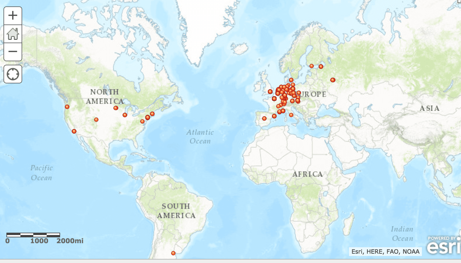
Figure 1. The original Arc GIS map.
Challenges in mapping extend beyond the ethical quagmires of how to present the truth. They can be far more pedantic. As Monmonier points out, even the colors used in a map can affect the way viewers consume a map.When picking the colors for the map showing a break down of Milhaud’s performance by genre, for example, we needed to contend with nine colors, each color corresponding to a genre. We needed to ensure that the map remained aesthetically pleasing while simultaneously employing a color scheme that is diverse enough that each point can be identified clearly from afar. Figure 1 and 2 represent the different ways that colors can affect the way a viewer perceives a map. Figure 1 contains the colors that Arc GIS assigns to a map, while Figure 2 represents the way our team decided to present the map. This particular map is an animation of Milhaud’s performances over time. Using a black and white themed map allowed users to focus on the movement of the performances over time as a whole, rather than individual performances appearing in a bright red color, distracting from the pattern the data presents.

Figure 2. Arc GIS map re-colored.
Similarly, while mapping, we often found small mistakes in the Latitude and Longitude coordinates we’d assigned to a location. We learned that it was imperative to inspect each point closely, a process that would often devolve into our scouring of coastlines to make sure that points that were intended to land in Los Angeles didn’t end up in the Pacific. On occasion, errors were easy to fix. In our map of all of Milhaud’s performances, a performance that occurred in Denver populated on our map in the middle of Kazakhstan. Luckily, someone had simply forgotten to assign a negative sign to the longitude.
Software
Navigating the treacherous waters of Arc GIS can prove to be a challenge for even the most astute Digital Humanists. Often times, small details make can directly influence the display of a map. For example, when one of my colleagues was working on a map comparing the travels of Milhaud to his performances chronologically. The map is incredibly important to our project, however, when we tried to share the map publicly, only the travels appeared. After spending a day agonizing over what the problem may be, we discovered that it was a simple matter of forgetting to publish the layer of performances. It was a two-minute fix. Map making software is full of these detailed dangers, and they can be mind-numbing to overcome.
So, why maps?
All in all, though there are many challenges to the map making processes, the potential it promises are far outweigh any inconvenience. The ability gained to view data in a new and creative way, and the concept of a new visualization of musical ideas is far too enticing to ever imagine giving up on the idea altogether. In fact, mapping offers untapped musicological potential. A potential that the Musical Geography project will continue to explore for years to come. To learn more about the maps we made for this project, visit our Map Gallery.
You must be logged in to post a comment.