Data Gathering
Introduction
Even with a project as focused as this one, as we built up an extensive database of performances of Milhaud’s music, there were a number of decisions we had to make as a team. For example, we had to decide what database management tool to use, what information was worth gathering, and what to do when we were missing information related to a performance. Here we review some of the decisions that informed the project’s scope and affected how we visualized our data.
Google Sheets vs. Elevator
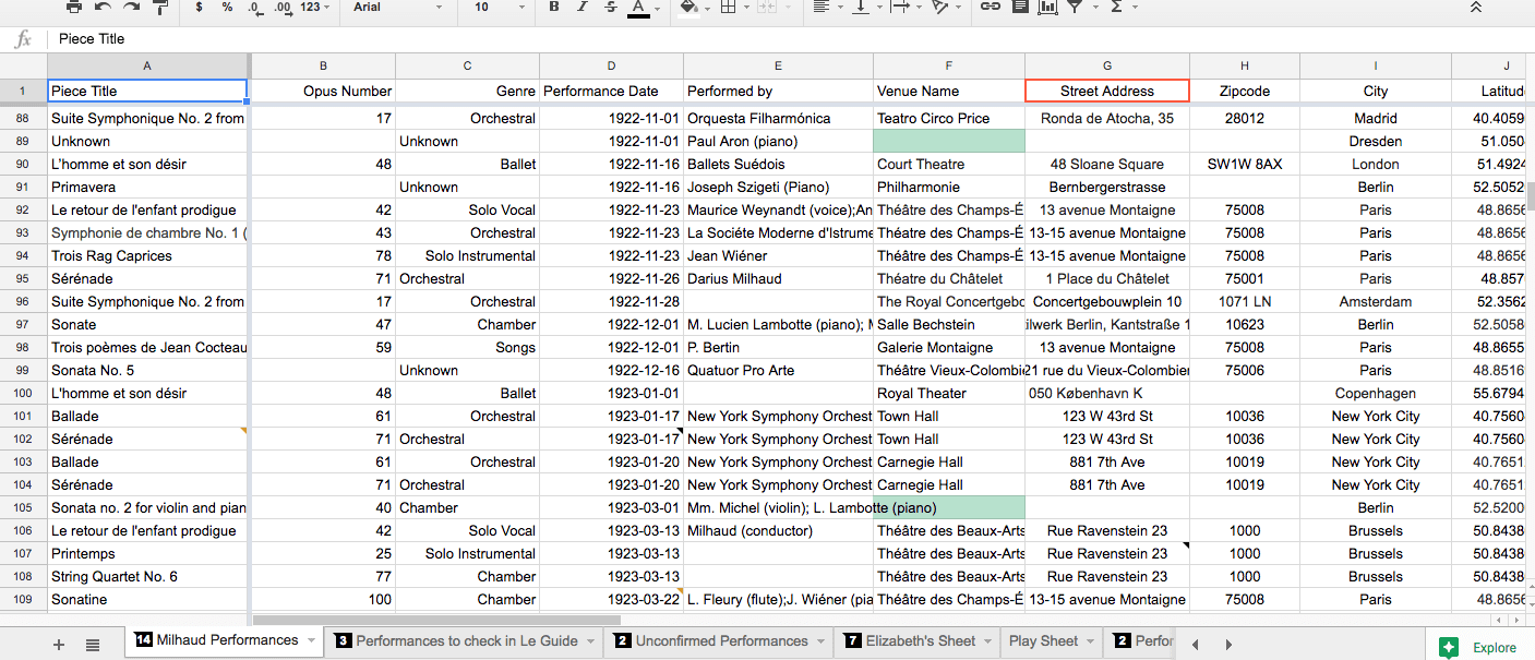
For the most part, we relied on Google Sheets to store our database. It was the most conducive to our work because we could all edit the spreadsheet at the same time, and because we were all relatively familiar with the software. The basic search function allowed us to find specific information within the spreadsheet, and the filtering function allowed us to view smaller chunks of the data when we needed to without sorting.
Elevator is an online repository and database management system developed by the University of Minnesota. We found that it was a more sustainable management system as it is proprietary; we worked with a developer at the U of M to implement changes useful to our project. In contrast, Google could choose to change or discontinue Google Sheets at any time. Elevator also allowed us to quickly check the consistency of lat-long pairs, and search for particular groups of data. It was most useful for exporting groups of data without having to copy and paste them into a new spreadsheet.
Missing Venue
Only on very rare occasions did we find a record of a performance with all of the information we needed in one source. Oftentimes, even after digging through a couple of sources, we weren’t able to find a specific venue for a performance. So, rather than agonizing for hours over one piece of information, we either guessed a venue from the city in question based on the genre and other known context, or gave a provisional lat-long pair in the center of the city. For example, we chose to include several performances without venues that we found in Anbruch, a German newspaper. To learn more about this source, view our sources page. Even though the venue was not listed in the publication, we could be confident that the performance happened because it was listed in a primary source. We were more likely to give an estimated venue in cities where there were only a few possible venues, like in Prague or Brussels. However, for some performances, we only specified the city because we didn’t have enough information to make an informed guess. For example, we gave provisional lat-long pairs in the middle of the city for several Paris performances because there are so many possible venues there to choose from. We did not include any performances where we could not find a city.
Missing Date
Similarly, we often did not have the specific date of a performance. For most of the performances that we included in the database, there was at least a year listed. There were a few performances missing a date entirely, but we decided to keep them if they included enough other information. For performances with a year, but not a month or a day, we listed the date as January 1st of that year, and made a note in the description box that the date was provisional. For example, we included two performances of Le Pauvre Matelot that took place in 1932, even though we did not have a month or day. We could be confident that the performance happened because it appeared in Anbruch, and we could estimate the date by the number of the newspaper issue. Other context, such as the location of the performance, allowed us to determine that we hadn’t already entered the performance into our database. We were not able to use date ranges at all because of the form required for the mapping platform ArcGis.
Missing Piece Name
We chose to include performances of Milhaud’s work even if we did not have a specific piece name. All of those performances are listed as “unknown,” but still have lat-long pairs and even sometimes venues attached to them. This way, these performances still show up on a map, which gives us a better idea of the scope of Milhaud’s work even if we don’t know the specific piece in question. We determined that we hadn’t already entered these performances in the database based on other context, such as venue, city, or who it was performed by.
Why include performances with missing information at all?
For the purposes of this project, we have created a database of performances of Milhaud’s work that is as comprehensive as possible. The ultimate goal of the project is to create interactive maps to represent this database, which makes some pieces of information more important to us than others. Ultimately, we want to know that a piece by Milhaud was performed somewhere. So if we have a location and confirmation that Milhaud’s work was performed there, we can include it in our database. Additionally, we created these maps to compare performances across different countries and cities, not necessarily across different venues. Thus, we could afford to put points on the map that are less specific for the sake of our research goals.
Mapmaking Methodology
Introduction
When it came time to start making maps, there were even more methodological details to consider. In the introduction of his compelling book How to Lie with Maps, Mark Monmonier points out that we as map-makers can’t help but tell a few lies with our maps. However, he also suggests that “the informed skeptic becomes a perspective map author…better equipped to recognize and counter the self-serving arguments of biased or dishonest mapmakers” 1 We strove to be “informed skeptics” of our own work, especially when we made decisions about mapping platforms, pop-up configuration, and general formatting. There were other, more practical considerations as well, like what to tell the mapping platform to use to geolocate. We went with lat-long pairs over addresses to ensure precision across the board. Here we review other details of our mapmaking methodology.
Mapping Platforms
We primarily used three different mapping platforms: Google Maps, ArcGis, and Elevator. Each one posed its own strengths and weaknesses that we took into account each time we started a new map. It was important to choose a platform that best met the needs of the map in question.
Google Maps: The facility of this mapping platform is what recommended it the most. It is incredibly easy to import a data set into Google Maps and see it on a map very quickly. It does not have quite as many features as ArcGis, however, and it is not a very sustainable platform to store our maps. So, we tended to use it for quick, experimental maps, like this map of Paris landmarks we made to develop our mapmaking skills right at the beginning of our research.
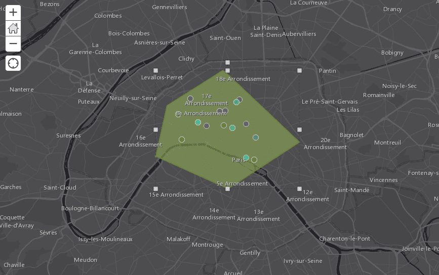
An example of a polygon on a map.
ArcGis: Despite its many complications, we used this platform the most heavily. It allowed for a lot of experimentation with things like polygons, heat maps, time sliders, and even analysis. However, its helpful features also came with complications.
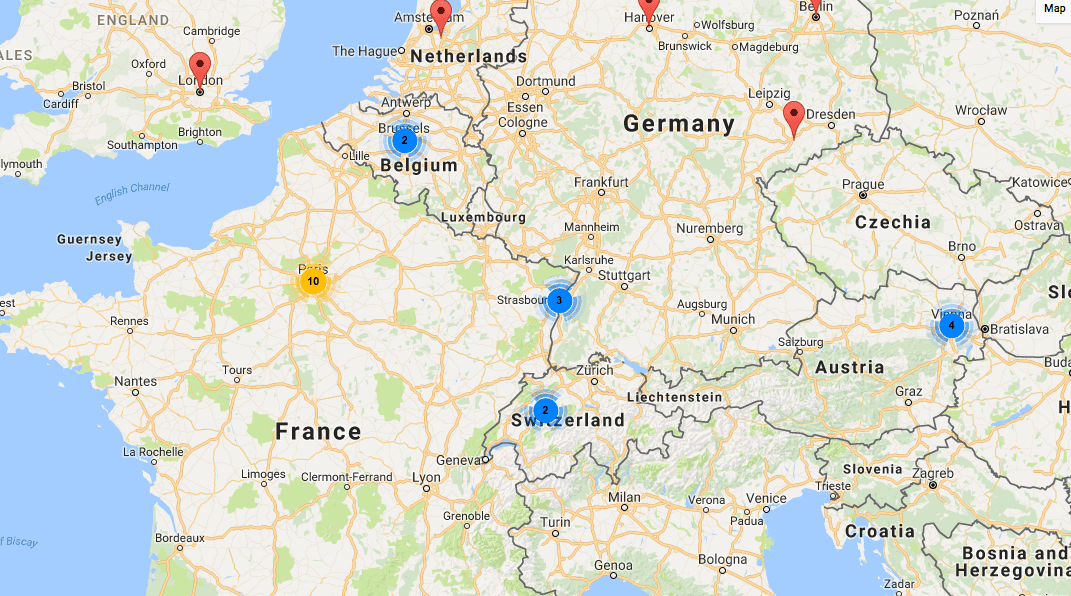
An example of Elevator’s special features.
Elevator: Although Elevator is a repository and database management system first and foremost, it has an exciting feature that automatically puts data into a map. These maps even include a feature that shows the number of performances in a city when you are zoomed out, which is helpful to show patterns at first glance. It also has a “spidering” feature that allows the viewer to see every performance in a particular city when they click on it. Spidering is helpful because Google Maps doesn’t allow you to see multiple performances at a single lat/long coordinate – it just shows the top performance. ArcGIS lets you see multiple performances, but you have to click “next” to get to the next one, so it’s still not easy to navigate.
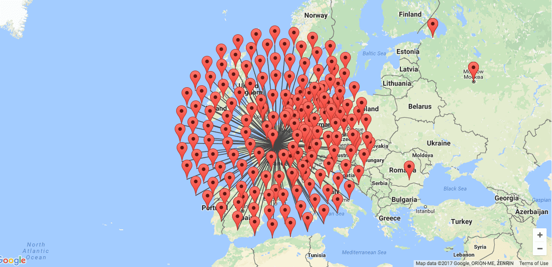
Elevator’s “spidering” feature.
We used the maps in Elevator to check that our data was consistent. We were able to catch inconsistent lat-long pairs on the map that did not show up quite as clearly on our spreadsheet. Like Google Maps, Elevator has fewer features than ArcGis, so we mostly used it as a tool to clean our data, or for quick, experimental maps.
“Pop-up” Configuration
“Pop-ups” refer to what appears when the map user clicks on a point on the map for more information. Depending on the platform we were using, we could configure the pop-ups to display certain fields over others. In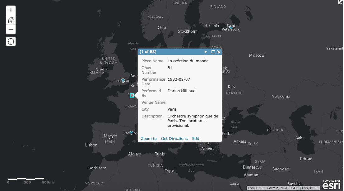 many cases, we decided to leave out the lat-long pairs and zip-codes on pop-ups to clean up the information the viewer can see. It can be overwhelming to see a lot of meaningless numbers. We even created a couple of “Story Maps” that take the reader through a guided chronological tour, with tailored information in the pop-up at each stop.
Formatting
It is easy to get carried away with formatting, especially when making maps. As we have already said many times throughout this project, it is important not to choose arbitrarily, because formatting matters not only aesthetically, but intellectually as well. The formatting of every individual map requires careful thought.
There are countless decisions to make: what colors to use, what icons, what layers to include, what background, whether or not to use a heat map. We tried our best to be aware of our choices and how they affected our audience. In some maps, we limited the amount the viewer could zoom in or out, so that they didn’t get overwhelmed by a huge amount of information in an area that was particularly crowded with points. To combat this kind of overcrowding, we also used the spatial analysis tool in ArcGis to show frequency of performances instead of individual points. In other cases, we gave the viewer the ability to toggle between layers of a map so that they could see either each individual dataset by itself on the map, or all of them together. As you can see, there were quite a few decisions that had to be made during the process that contributed to the audience’s experience, and to the overall impact of our maps. For this reason, it was vital to pay close attention to these (sometimes tedious!) details. Explore our map gallery to see how these formatting decisions varied across different maps.
You must be logged in to post a comment.