During the past year or two, the various Musical Geographers associated with this project have gone through several ways of organizing our data. Some are clearly more effective than others: the first summer, student researchers began with a easily-editable but ultimately vast and unwieldy Google Spreadsheet. The next summer, we were able to use our own homemade database, which cleaned up our data significantly and made it much easier to organize consistently. This semester, we’ve arrived at our third iteration of a data organization platform: Elevator.
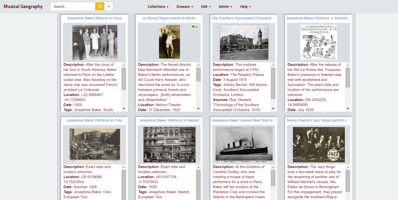
The entries in my Elevator collection, which holds information about performances by Josephine Baker and Sidney Bechet during the 1920s
Elevator is a Digital Content Library that is created and managed by the University of Minnesota. Using this platform, we can create our own templates for data entry that include whatever categories we want: locations, dates, text descriptions, links, program information, photos, videos, and essentially anything else we can think of. Designing my own template has given me a lot of flexibility, and it has made me think more carefully about which areas of information I’m focusing on. Though it is still being expanded, Elevator is much more powerful than anything we’ve worked with before, and it has a few more added benefits: Our data will stick around until long after our St. Olaf email addresses expire, and when we encounter glitches, we can talk directly to experts who know how to fix it. As a platform, Elevator is customize-able, yet it requires no coding abilities on my end- which, unfortunately, made me a bit overly optimistic about the facility of my mapping endeavors. “I can have my data in any format that I want!,” I thought. But not so fast…

Part of the data entry template I created in Elevator
To put it simply, mapping platforms tend to be quite picky about the kinds of data that they want from you. This means that if you use the full flexibility that Elevator’s templates can offer, you can end up with CSVs that look nothing like what a mapping platform wants to read. Originally, I wanted to use Omeka Neatline to create my map, but there were some real challenges there. Omeka wants location data in Well-Known Text rather than in a Latitude/Longitude format, which is what Elevator gives. Additionally, I would have had to use the exact categories for data that our particular Omeka accounts were designed to use. Many of those categories applied to projects we’ve done in the past, but for my own map some of these (like “composer”) aren’t necessary. On the other hand, I had other categories in my Elevator template that weren’t included in Omeka’s way of organizing information. The moral of the story here is: your ideal project goals do partially determine how you organize your data, but so does the mapping platform.
That said, some platforms are much more easy-to-please than others. I’ve ended up building my project using ArcGIS’s “Tour” StoryMap, which actually lets you download a sample CSV so that you can see exactly how it wants you to input your data. ArcGIS StoryMaps is much more limited platform than Omeka is in a lot of ways, but those limitations mean that the experience both for the builder and for the user is much, much, simpler.
You must be logged in to post a comment.