In order to create digital maps that are effective in the ways we want them to be, it is first helpful to critique “normal” maps- static, print-based maps- and to analyze how they meet or fail to meet our ideas about what maps should be able to do.
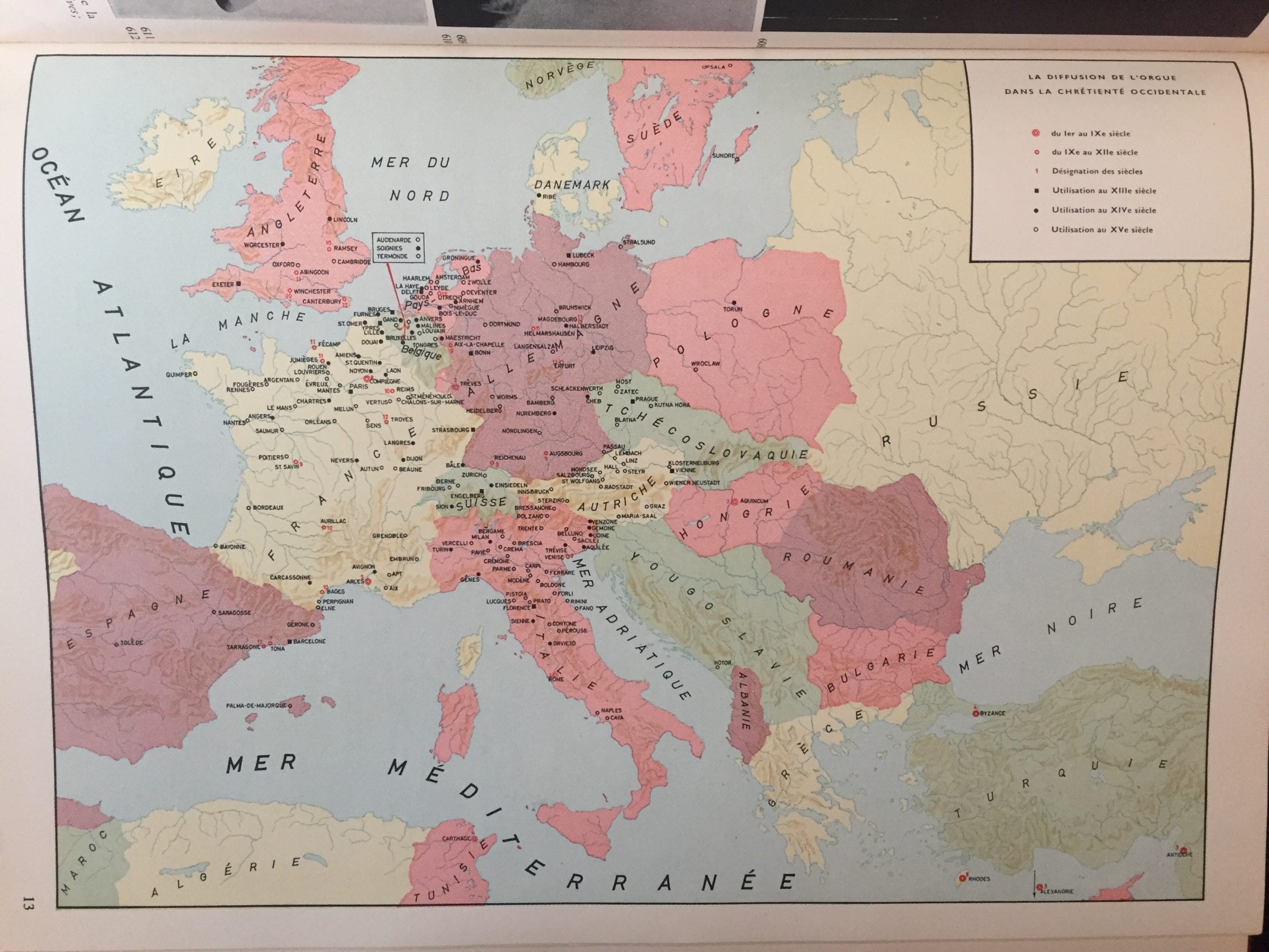
The map above, taken from the Atlas Historique de la Musique, shows the geographic diffusion of organ use in Western European churches, focusing on the 1st through 15th Centuries. It displays the expansion of organ usage through color- and shape-coded markers, which represent the cities where the organ appeared and the century in which the instrument arrived in those cities.
One of the map limitations of a map like this that the diversity of the coded markers means that it’s difficult to pick out trends at first glance, although some do become clearer with more intense study (for example, French cities gained the use of the organ centuries before most Italian cities). Yet like many static maps, particularly those without any visible explanatory text, the map seems to generate more questions than it answers. Why were there places in modern-day Turkey that used the organ long before cities in Italy? Significantly, the map also does not show any causality or relationship between cities- one is left to question why and how the use of the organ spread from one locale to another.
At least theoretically, digital maps could present information in a way that clarifies these questions and makes trends more evident. Some platforms can show chronological development, making general trends about change over time easier to spot without having to decode dozens of markers. I could also imagine a digital map including information about the relationship between the different spaces: Arrows could show how the organ spread from one city to the next, for example.
For our first DUR mapping project, the class made a few different Google Maps on several different research topics. Eli and I focused on mapping the origins and spread of opera in Europe, according to this timeline of European opera premieres in the New Grove Online dictionary. Using this source allowed us to focus on the mapping side of the project, since the data points had essentially been collected for us. Additionally, the “type” of map is similar to that of the print map in the Atlas Historique: Both show the spread of some type of musical development throughout Europe over the course of several centuries.
Unfortunately, the Google Map we made does not yet fulfill our lofty chronological mapping goals. Despite the fact that color-coded markers were an aspect we critiqued in the print map above, we ended up using a similar technique to show change over time, since on its own Google Maps doesn’t include a timeline feature. However, even the simple ability to zoom out and change the level of visible detail presents an improvement over the print map, in which the dozens of markers could be visually overwhelming and difficult to sort through. The pop-ups themselves also have a more usable function in a digital map; here, they include composer, piece, and theater information. It would be relatively easy expand the pop-up function to include more descriptive text or images for each opera.
You must be logged in to post a comment.