Our research team came into this project with a few simple questions: How can maps help us better understand H.T. Burleigh’s significance as a composer and performer, and how can maps reveal the full extent of his influence? As we discovered early on in the project, Burleigh is an ideal candidate to introduce to a digital mapping platform. We can pinpoint parts of his tours with the New Orleans Jubilee Singers and where he interacted with Antonín Dvořák at the National Conservatory. We can map his own performances, where others were performing his music, where he traveled, and where his influence spread over his lifetime. Our maps highlight new areas of research to explore as we continue to uncover more information about Burleigh.
The work of researching and mapping Burleigh’s life and legacy was completed by two groups of St. Olaf undergraduate students. In January of 2019, the first group produced 10 impressive maps that can be found on the “Maps Gallery” page. Because no significant work on mapping Burleigh had ever been done before, these maps are intended to be an overview and introduction to his life and legacy. Two members from the January group continued the work on this project through St. Olaf’s Collaborative Undergraduate Research and Inquiry (CURI) summer program. The digital archive work, data entry, and original maps that the first team produced allowed the 2019 CURI team to make new maps with narrower focus. This page showcases the work of the CURI students that built on the original maps to rethink, reinterpret, and make more maps of Burleigh’s exceptional career.
To return to the project’s home page, click on the image of Burleigh (left). There, you will find the “Maps Gallery” page that holds all of the original Burleigh maps, a bibliography, and more.
Before we introduce the work that was accomplished over the summer, we would like to acknowledge the work that came before it, and how it’s influenced our mapping choices. One of the most important things learned while collecting data in January is that the purpose of maps cannot be to visualize optimally rich data. There is a unique kind of data richness achieved by interactive digital maps by virtue of combining geography, symbology, spatiality, data, and art. However, because each of these elements provide a wealth of information on their own, each detail included should be vital to the story the map is trying to tell. The map below does not necessarily tell a clear story. The symbols, colors, and overall busyness are distracting for users. Where do you start? How does each stylistic choice benefit telling the story of Burleigh’s life and legacy? This map shows one thing very clearly ⎯ Burleigh was everywhere. But the user should take away more than this observation. The following page presents argument-based visualizations that happen to be maps. The topics and stories that we will discuss could be argued in essays, lectures, or other visualization tools. However, we chose to make more spatial arguments with maps to learn about the stories and contexts of American music history.
One of the first questions we asked ourselves this summer was, “how do we provide racial and sociopolitical context for our audience in a map?” We started by studying scholarly articles, academic books, autobiographical accounts, and other digital humanities projects that examined Jim Crow era America in different ways. These included excerpts from James Weldon Johnson’s Black Manhattan, Daphne Brooks’ Bodies in Dissent: Spectacular Performances of Race and Freedom, 1850-1910, Lynn Abbott’s Ragged But RIght: Black Traveling Shows, “Coon Songs,” and the Dark Pathway to Blues and Jazz, and many more that can be found in our bibliography. We were also inspired by projects like Todd Decker’s Race on Broadway that incorporate racial demographic data into maps to illustrate political nuance.
Our biggest obstacle in incorporating this kind of data into our maps was time. In a perfect world, a database or spreadsheet with the racial demographics of a city, down to building-level specificity, would already exist. We would then be able to map performances and visualize what the racial makeup of the audience might have been. Even though this is not as comprehensive as a list of concert attendees, it gives us an idea of who might have listened to Burleigh and his music. While this kind of data exists in the form of old census records, it has not been digitized or made available in a quickly accessible way. We were, however, made aware of a platform called Social Explorer. This tool provides mappable census data, and a platform for uploading our own Burleigh data, allowing us to put the two sets of information in conversation with each other. The two maps below represent our first attempts at incorporating racial context into interactive maps using this tool.
This map uses 1910 U.S. racial census data that is organized into population density by race. Each orange or green dot represents 10 people, and each blue circle represents one Burleigh performance. Green is the white population, and orange is the black population. What is unclear is how the map places each dot. Most likely, there is an algorithm that spreads them out evenly, as opposed to mapping the races address by address. The most interesting way to interact with this map is to look at a Burleigh location using a very narrow scope, about a mile or two in width. Looking this way may help us understand who would have been in proximity to Burleigh, and therefore who his audience was. It is also very interesting to look at each county’s census data. For example, Erie County, Pennsylvania was over 99% white. The total population was 115,517 people, and African-Americans accounted for only 392 of them. After a quick run through the data, something interesting appeared. Every major county that Burleigh performed in was at least 95% white, except for one: District of Columbia County to which Washington, D.C. belongs, where the black population was only 71% white. While doing this research, and engrossing ourselves in the lives of prominent black thinkers, it was easy to forget that African-Americans were by far the minority group. This map helps put that in perspective.
This map represents the proportion of black residents per county as documented in the 1920 Census. The counties with the darkest blue show the highest proportion of black residents. On top of this Census Map is a map that documents performances of Burleigh’s music which is sorted by the race of the performer. White dots with a smaller black outline represent white performers, and white dots with a wider black outline represent black performers. The ability to select by county gives us a closer look at cities instead of State data on race. This map shows us that black and white performers weren’t performing in the same venues unless it was in a large Northern city like New York City or Chicago. Since gathering information on audiences from this era is so difficult, this kind of map is useful in that it suggests that different populations were listening to Burleigh.
Here is the same data as above, clustered on a static map. These clusters aggregate our data to analyze whether or not there were geographic trends in black performers or white ones.
These two maps show the same data set in two different ways. The map on the left was created in January and clusters every Burleigh performance we collected. Once the data was collected, there was no additional sorting. However, the clustering effect immediately shows viewers trends in where Burleigh performed. The map on the right sorts that same data into categories based on sponsorship and venue. We asked ourselves, “Outside of a geographic marker, what significance does a venue hold?” In January, many of the performances included enough information to determine the funding source. We therefore decided to sort according to sponsorship if it was listed, instead of strictly by location. This choice was motivated by a desire to understand more about the sociopolitical environment of a performance rather than strictly a physical location. For example, if a benefit concert was held for Howard University, but the concert took place in a church, which of those two pieces of information is more important? For the purposes of understanding Burleigh, the symbol map privileges the former. While the sorting method was different, the information provided in the pop-up remains the same as the previous map. The symbols are divided into 5 categories: Society/Club Sponsor, School/University Sponsor, Religious Sponsor, Private Home/Sponsor, and Performance Hall. These categories covered almost all of our data except for an “Alternate Location” category which includes parks, parades, and locations that we didn’t have precise venues for.
Using symbols led us to new questions. How often did Burleigh perform in churches? How frequently did he perform for societies or clubs? The simple answer is that Burleigh performed the most in churches according to our data — some 120 times. Part of that number is influenced by his work at St. George’s in New York of which we have 60+ performances recorded. However, that number does not capture even close to the entirety of his career. On the first map, we accounted for this by creating a separate cluster for St. George’s appearances. But on the second, because each location is not distorted by the number of performances recorded, each location appears to carry equal weight. Obviously there are pros and cons to both, but we believe putting these maps side by side offers a more truthful user experience.
For one of the last weeks of the summer, the CURI team had the opportunity to conduct research in Washington, DC at the Library of Congress and Howard University. We looked at several collections between the two institutions, and were able to bring a significant amount of new data back to St. Olaf. To create a different user experience, we created StoryMaps through ArcGIS to show off our media-heavy data.
Each StoryMap uses the new data to make new kinds of maps and fill in previously unknown gaps. Feel free to scroll through the prose, pictures, and play around with the embedded maps. In addition, we have shared photos of documents, concert programs, and other photos from the trip that capture what we saw on a day to day basis in DC.
One unique aspect of the summer’s CURI experience was the ability to work closely with a client. Beginning in January, we worked with the H.T. Burleigh Society to conduct original research, engage in critical discussion, and receive constructive advice, with an end goal to publish several maps on their website. These maps are in keeping with the Burleigh Society’s mission to further the performance and study of H.T. Burleigh’s music and legacy. Research is always enhanced when it can contribute directly to organizations that are working towards the same goals, so we were honored that they asked us to partner with them on this project. In addition to the two maps below, we edited the Burleigh Significant Performers map to include a broader range of artists. These maps will be showcased on the H.T. Burleigh Society website.
Burleigh Archival Collections Map
This map provides the locations of 26 institutions across the U.S. that hold archival materials related to H.T. Burleigh and his music. Each marker’s pop-up provides the name, city, and address of the affiliated institution. Additionally, the pop-up provides a link to the institution’s website. The amount of Burleigh-related material in each collection differs greatly from place to place, some with a small Burleigh folder and others with a large collection. For institutions with more expansive collections, like the Library of Congress, a starting place is recommended with a more direct link. In addition, there are different types of institutions featured, each with unique research privileges. Some are public libraries or museums, while others are privately owned collections. Contact each institution separately to learn more about their visiting permissions. The map does not include web-based resources such as digital newspaper archives, streaming media, or other online collections, but the consultation of these resources is encouraged.
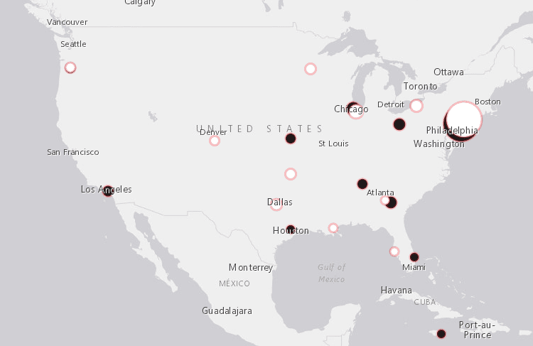
This map represents recently documented performances of H.T. Burleigh’s work, starting in 2017 and the start of the H.T. Burleigh Society. The H.T. Burleigh Society runs a website and a Facebook page, both of which document events, concerts, lectures, and conferences that relate to H.T. Burleigh or reference his legacy. Each dot is an event that the H.T. Burleigh Society has posted about or sponsored. This map is the only one out of the three that will be updated consistently by people outside of St. Olaf. Our goal was to create an adaptive resource that documents what is currently happening with, and around, H.T. Burleigh’s legacy.
Thank Yous!
This work would not have been possible without the support of many outstanding mentors. First we would like to thank the DiSCO team, especially Ezra Plemmons and Ben Gottfried, for helping us show WordPress who’s boss. We would also like to thank research librarian Ann Schaenzer for troubleshooting census data records. We are so grateful for the Burleigh Society team, Marti Slaten, Lynne Foote, and Kori Hill, all of whom inspired in us a great love and appreciation for H.T. Burleigh. We were also able to talk with scholars from across the country who graciously offered their time to talk about their work and answer our questions. These include Lucy Caplan, Kristen Turner, Sandra Graham and Kori Hill. Last but not least, we’d like to thank Louis Epstein for bringing us into the Musical Geography family, and providing supportive mentorship throughout the process.