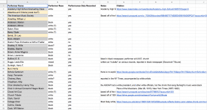
This week, Thea and I were able to reorganize our “Where Burleigh’s Music was Performed” data into spreadsheets that categorized the performers by race. The most difficult thing about this process was accurately determining (or sometimes guessing) the race of the performer. I heavily relied on reporting trends of the 1910s-30s in order to make educated guesses when pictures or explicit mentions of race were not available. For example, what kind of newspaper reported on the person? And under what circumstances? If a performer appears in the Crisis once briefly, alongside a detailed concert review of a famous black performer, the performer might be white. Or if a performer is quickly mentioned in the New York Times’ “Music and Art” section, with all black supporting artists, the performer is likely black. In addition, when groups like “church choir” were listed as performer, we looked at the original source cited by our January teammates to learn more about the group mentioned. In many instances, revealing if a location was historically black or white was all we needed to make a fair judgement. These kinds of nuances required a good amount of research. While working, Thea and I kept a spreadsheet where we noted how we arrived at our educated guesses, and the source that pointed us in that direction. As you can see below, not all of the performers needed notes — this means that their race was either explicitly stated somewhere after Googling around, or a clear picture provided the answer. In a few instances, we went back and changed a performer’s race after disagreeing with the others’ conclusion.
Organizing the data racially was very eyeopening. For one, the gap between performances by white performers and performances by black ones was not nearly as large as I would have guessed. The performances by Marian Anderson, Roland Hayes, and Paul Robeson partially skewed the data so that black performers had 60 more performances than white ones. However, out of 132 performers who definitely sang Burleigh’s music, 69 were white. This means that we actually have fewer black performers performing Burleigh, at only 63 people.
In our spreadsheet, there are 25 names highlighted yellow that we haven’t been able to research yet. However, they are listed because they recorded Burleigh’s music under a major record label during his lifetime. We think it is safe to assume that if they recorded his music, they also performed it live at least once. In addition, there is a column labeled “Performance Data Recorded.” This refers to whether or not we already had a performance date/location of Burleigh’s music by this person from January. Because of this, only the performers with “yes” in this column had map-able data. Those with “no” require more research. Even though we have more white performers on the meta-spreadsheet, our primary sources indicate that black performers individually incorporated Burleigh into their programs more regularly. What does it mean that white performers were more likely to perform Burleigh’s music only two or three times? Does it mean there is much more research to be done on white performers? My first reaction is yes.
Despite having many more questions to think about after organizing this data, Thea and I both made maps! Thea chose to use the census data program Social Explorer (here is her blogpost about this data), and I used ArcGIS. My map might be clearer to navigate using this link. The white bubbles indicate instances of Burleigh music by white performers, and the black bubbles indicate black ones. There are a few misleading things about this map. For one, there are many instances where the locations overlap, especially from a wide view. The white bubbles seem to cover the black ones, but I’m not sure that there’s a way around that. Also, I’m lying with maps! Just because the bubbles are the same size does not mean they represent the same number of performances. Which is very very misleading. Because this data was entered as two separate spreadsheets, ArcGIS clusters the data in each separately. I could not find a way around this, but I got the amounts as close as I could. The largest bubble for white performers represents 40 data entries, while the largest for black performers represents 52. I will continue to look up possible ways to get around this unfortunate Monmonier-ism.

You must be logged in to post a comment.