When we began this project, one of our first readings was parts of Mark Monmonier’s How to Lie with Maps1. Now that Jacob and I are working on our editing specialization, I’m reminded that his lessons apply to words as well.
Example map from Monmonier’s book, How to Lie with Maps (95).
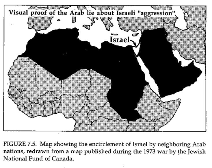
That might seem like a little bit of a no-brainer. Obviously, it’s easy to lie with words, but what I mean is not an outright lie, but a sort of unintentional lie. A lie that is a lie in presentation or portrayal. In How to Lie with Maps, Monmonier gives many different examples of how maps can distort or misrepresent information, even if they are technically presenting correct information. One of the examples he gave was a map of Israel and its neighbors that makes Israel look exceptionally vulnerable. Monmonier points out that while this map is geographically correct, it provides a misrepresentation of the situation because it fails to give a full picture by leaving out other important information like Israel’s alliances and military. While this is hopefully a more dramatic example of misrepresentation, it provides a clear and thought-provoking example of what can happen if we don’t think critically about what and how we portray our subject. Also, the creator of this map was clearly trying to use the map’s ability to “lie” for their own argument, but we might be at danger of doing something a little different.
In our case, the way that I see the potential problem of misrepresentation arising is related to something Dr. Marti Newland said when we spoke with her about the project2. My paraphrase will probably not do her justice, but she noted that many times, when attempting to recognize previously under-represented musicians, there is a tendancy to focus on how they overcame. Focusing on that aspect of what they accomplished can actually undermine the effort to reassert their legitimacy and getting them recognition because it makes their position as someone discriminated against the most important part of their story instead of their accomplishments. On our project page, we need to figure out how to balance what Burleigh accomplished without undermining or unintentionally belittling his accomplishments by focusing on the racism he faced.
As editors, Jacob and I are ultimately responsible for our class’s project’s portrayal of Burleigh, and that’s a big responsibility that I don’t want to take lightly. Again, we don’t want to unintentionally undermine anything that our maps seek to do or our overall argument that Burleigh deserves a place in the canon. It’s been said before, and it’s probably important to remember every time we sit down to write anything: complete objectivity is impossible, so we need to figure out to recognize, manage, and utilize our biases and the way that we weave together words.
My advice to future editors is this: make sure you are aware of the traps of representation or misrepresentation involved with your project so that you can face them head on. Maybe that is clear, but sometimes you might need someone with a little bit more wisdom to point the challenges out. Oh, and read Jacob’s blog post, because he has some other tips and tricks for you too!
1Mark Monmonier, “Introduction” and “Maps for Political Propaganda,” in How to Lie with Maps (Chicago: University of Chicago Press, 1996), 1-4 and 87-112.
2Dr. Marti Newland and Lynne Foote (H. T. Burleigh Society Co-Founders) in discussion with the class, January 9, 2019.
You must be logged in to post a comment.