From Spreadsheet to Map
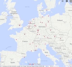
Cataloging over 300 performances of Darius Milhaud’s music in one week is no small feat. Our research team spent all of last week locked in the library, feverishly racing to compile as much data as possible so that we could show you this…
Okay, so maybe the map doesn’t look like much now, but just imagine it in a few weeks, after we’ve had time to thoroughly analyze our data and plot it in the most visually appealing and practical manner! As we begin to assemble more and more performances, it is important to critically consider uses for our data. Simply by virtue of the incredible mass of performances we’ve collected, we are able to breakdown our data in various ways. Possible maps we may make out of our information include (but are not limited to):
- A point based map sorted by piece title, allowing users to see if a piece was more popular in a certain area than others.
- A point based map sorted by date, allowing users to discover which pieces were popular during specific years and if that popularity has geographic significance.
- A point based map sorted by performing force. This would enable users to track a specific performer or group of performers as they traveled the world performing Milhaud’s works.
- A heat map based on frequency of performance, allowing users to see more clearly the focus of Milhaud’s popularity.
- Faceted maps comparing the maps listed above.
The possibilities for organizing our data are nearly limitless. In fact, we’ve already begun to discover fascinating patterns in our data.
Trending Now
Our map may not tell you what color palette is all the rage in Milan this summer, it can show you the hottest places where people performed the works of Darius Milhaud. If you zoom in, you can see that there are over 124 performances in Paris alone. When viewing the map from a global perspective, the extensive nature of Milhaud’s popularity is evident. It’s also interesting to note the relative isolation of performances of his works in Paris. Milhaud’s works were performed in several cities in Germany, while Milhaud’s French premieres happen overwhelmingly in Paris, with a small number of performances occurring in Aix en Provence, Nantes, Lyon and other small cities.

Notice the spread of performances in Germany compared to the Parisian isolation of performances in France.
What can this map tell us about Parisian cultural centrality? What can we say about Milhaud’s successes in Germany? Could the less isolated performance of his music in Germany have contributed to his later premieres at the Paris Opera? Each new trend that becomes apparent when data is mapped allows for deeper questioning of what we think we know about Milhaud and the world of 20th-century music.
The more we research and add to our database, the more points we will add to our map. The more we analyze our data, the more interesting and unique our maps will become. Perhaps our Maps will elucidate some century old question about nationalism and modern music, or perhaps introduce a new argument into musicological canon, or perhaps I’m far too passionate and optimistic about the value of mapping. Regardless, keep following our blog to make sure you don’t miss the next discovery of our mapping adventures! You never know what kind of map you might meet around the corner.
You must be logged in to post a comment.