Following my last blog post about my hand drawing map design, here it comes a preview of the final project. Now that I got the chance to actually put all my data points onto the map, many provocative aspects of these digital maps became clearer. While I was excited about all the innovative interactive features that would show up on my final product, during our workshop session, Dr. Lincoln Mullen visited our class and gave us many insightful feedback on our works in progress, including drawing our attentions back to static maps…
Wait… We have been praising and advertising the advantages of interactive digital maps for the whole semester, and now we are going back to the old-fashioned static maps?! On a second thought, however, these two types of maps may not necessarily be mutually exclusive, but a good compensation to each other in many cases. For instance:
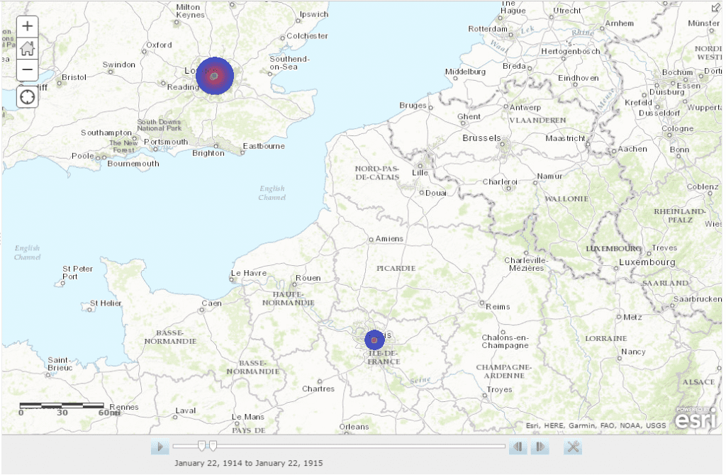
Work in Progress – Time Lapse Map
A good rendering of what I initially depicted, this time lapse map achieves the goal of juxtaposing the frequency of performances in the two cities using the playback feature. As it turned out, there are both coincidence and discrepancy showed on the heat map, from which we can ask many valuable research questions that dig into the causation of such phenomenon. In order to emphasize this provocative side of the map, as Dr. Mullen suggested, I could use static captures of the animated map as a supplemental guidance to highlight both the diachronic and synchornic features of this map, and potentially make an argument with further research – which connects back to my initial concern about making this map series.
London Paris
Year 1 Map A Map B
Year 2 Map C Map D
A Sketch Up of the Static Map Group
Therefore, in addition to the interactive digital map, I plan to add a group of static maps that captures the significant moments when the two cities have coincidence/discrepancy. Vertically the map group will diachronically compare the changing number of performances at one city throughout times; horizontally it synchornically compares the amount of performances of the two cities during the same time period. This addition of static maps can not only help the users to better understand how to manipulate the map,but also potentially inspire them to use this map as a tool of making arguments and asking provocative research questions.
You must be logged in to post a comment.