At the beginning of the semester, we spent a class period hand drawing maps together and sharing the information conveyed through those graphic representations. Before I diving into the technical stage of digital mapping, I want to go back to this activity one more time to give a preview of the final product.

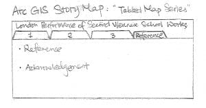
In order to introduce and analyze the data set from different perspectives, I decided to make a series of maps in which each individual map focuses on one specific function of interactive digital maps. The “Tabbed Map Series” of ArcGIS story maps is a handy tool to organize different maps, regardless of their mapping platform, into one interface where users can easily switch between different maps while having a good sense of the context of the whole project.
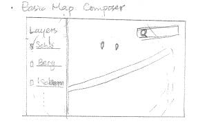
I. Basic Map: Layered Composer Map

The first map in the map series will be an overview of the whole data collection. Layered by the name of composers, this map will contain a search function that allows users to type keywords into the search bar, such as location, piece title, performers, event title, etc., and find the corresponding information.
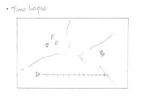
II. Time Lapse Feature

Different from the previous map, the second map focuses on involving temporal feature into a geographical map. Specifically, using the time lapse tool on a heat map, this map can compare the frequency of concert performances between London and Paris during a specific time spectrum.
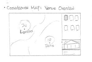
III. Crowd-source Map: Venue Overview

An exploration of a beta feature of ArcGIS story maps, the crowd-source map allows the users to have an overview of each individual venues in London and Paris that had hosted performances of the Second Viennese School. In this map, users can learn about each individual concert hall in the information column on the right side, in addition to exploring the geographical relations between venues by clicking on the maps.
In general, these maps aim to provide diverse angles for users to explore the data collection and create a more innovative experience learning historical records of concert performances different from reading catalogs and analyzing statistical charts.
This is amazing. I need to ask more students to upload hand-drawn visualizations as a part of the planning process!