At various points in this course, the question of whether a digital map has to have or make an argument has pushed itself to the forefront of our conversations on the digital humanities.
On the one hand, I might argue that, well, of course it does. Not so much because it has to, but simply because it does. Even a book of fiction quite arguably has an argument.
But let’s compare the humanities and the scientific method of coordinating research and arguments.
The scientific method is a little more straightforward, defined as “the set of assumptions, rules, and procedures scientists use to conduct research”1 (page 35) and composed of a rigid structure of hypotheses, theories, and laws. A scientific map, therefore, would be operating under a certain hypothesis used to guide a controlled experiment – the scientific map might be what is otherwise known as a graph. Ostensibly, the arguments made using this process are fairly objective, and the data is meant to speak for itself.
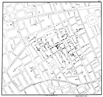
Halfway between strict SCIENCE and the humanities are the kinds of maps used by researchers in the field of public health. For example, in 1854 England, John Snow used a map of cholera cases in order to triangulate the source of the ongoing epidemic in London. In making his map, Snow already had a “causal theory about how the disease spread – that guided
the gathering and assessment of evidence.”2 His theory was based on previous mapping of cholera epidemics prior to 1854 (cholera was a fairly rampant problem in those days), but once he had an impression of the most-likely scenario, he used that in order to make the next map. Not only was his map argumentative, but it was a tool designed to display data that he already had interpreted in a way that could be used to persuade others of the seriousness of the situation, in addition to locating the contaminated well spreading the cholera. Snow’s map therefore involved multiple layers of map-usage and argumentation, with maps both passive and active participants in the argument.
Arguments in the humanities can be a bit tricky. For one, there isn’t always (there are exceptions) a clear application to research in the humanities – we’re not saving lives or at least preventing further death by water contamination, as John Snow did, and we probably won’t find the vaccine to some nefarious disease, which is the advertising pitch for funding STEM subjects. Furthermore, humanities research involves, well, humans – in the messiest possible ways. Science may have the literal mess of body parts and strange substances, but humanities research is all about how people think, express themselves, treat each other, create. None of that is cut and dry, although it should be universally understandable in some form or fashion.
When we make an argument in the humanities, it says something about the human condition. Our argument isn’t always clear as we conduct our research, and there isn’t always a clear hypothesis to follow up on – in fact, there’s very little you can assume to know about how humans think. In the same way, it isn’t always clear in digital humanities map what the argument is going to be, until the map is finished and the argument is read from the hypothetical page. The process of visualizing the research data is as important as the argument itself, and often lends itself to a more open, less biased interpretation of what the map represents.
1 Introduction to Psychology. Minneapolis, Minnesota: University of Minnesota Libraries Publishing edition, 2015. Accessed from University of Minnesota Libraries Open Textbooks, May 16, 2017. Web. 35. https://www.lib.umn.edu/publishing/works/textbooks
2 Edward Tufte, “Visual and Statistical Thinking: Displays of Evidence for Making Decisions.” Visual Explanations: Images and Quantities, Evidence and Narrative (Cheshire, CT: Graphics Press, 1997): 27-54. Print. 29.
