Thus far, we have read extensively about mapping practices and methodologies, and we have also held several Skype “dates” with prevalent scholars working on digital humanities projects (including Diana Sinton, Kate Elswit, Harmony Bench, and Todd Decker, all of which have been extremely illuminating). Now, I have asked myself questions about the purpose of our maps, how to display uncertainty, how to deal with the inherent bias of mapping, and how to deal with activism through mapping. Overall, I’ve looked at my project through different lenses and perspectives, but still have not figured out specific ways of incorporating these ideas into my maps (mostly because I still don’t know how I feel about some of the problems with mapping).
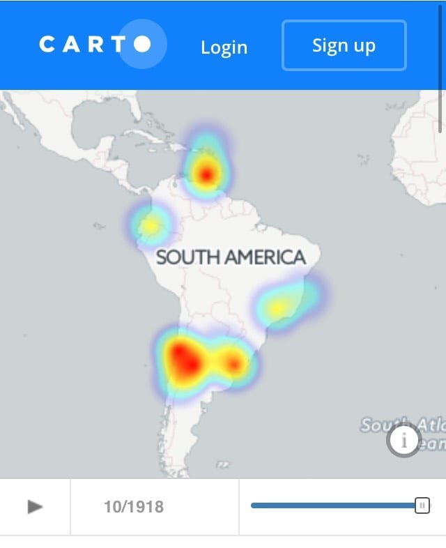
One of Harmony Bench and Kate Elswit’s research projects focuses on the wartime touring of Anna Pavlova ‘s company in South America during WWI (pictured here) along with the touring of the American Ballet Caravan during WWII.
More so than ever before, I find myself wondering if map should make arguments or not (or if either answer is wholly correct). In some situations, I think that it may be helpful to create a map that tells a narrative or story, and in another, it might help to use a map to make an argument. Additionally, you could use a map to simply organize and help visualize research and other data that will be used for more traditional books and papers. In our Skype chat with Harmony Bench and Kate Elswit, they strongly advocated for maps that make arguments.1 Moreover, they pointed out that a map should make an argument that you would not otherwise be able to make through prose. Immediately, I reacted negatively to this – what about maps that offer an immersive, educational experience in a different time and place in order to better understand historical events?
Conversely, though, when Todd Decker said he didn’t need his map to make an argument because his book would argue instead, I acknowledged that the book would be a fine idea, but still felt that perhaps the map could have included just a little more information and could substantiate his argument.2 So, I feel as though I cannot fully agree with any of the opinions set forth by scholars we’ve conversed with (though I did learn a lot from them about research process and different methodological preferences, of which I am grateful). I think that when I make my Gulag map, I will start with just trying to display the argument that I already have written out in prose (that it created a large-scale exchange of culture and ideas through music), and then I will look at the map and see if I can draw any conclusions from the information once I can see it in a different way. I’m sure that an actual map will tell me things I hadn’t known and will help me make connections I previously had not.
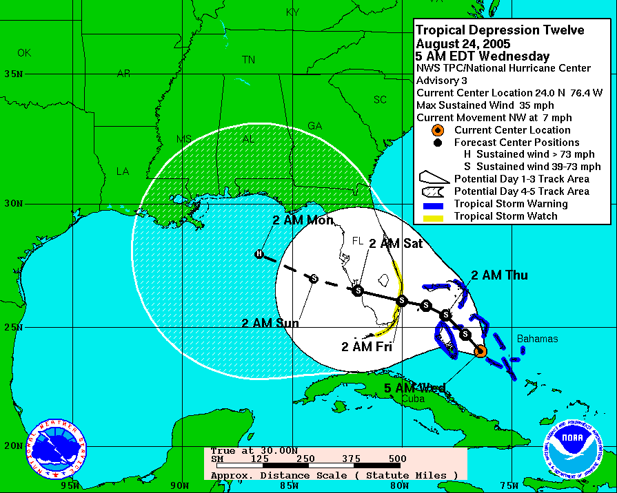
Initial cone of uncertainty for Hurricane (then tropical depression) Katrina, August 24, 2005.
Delving more into the representation of information in maps, I have learned a lot from our conversations about uncertainty and map bias. Firstly, I found our conversation with Diana Sinton extremely helpful. Particularly, her advice about mapping uncertainty pertain well to my project. Many of the Gulag camps no longer exist anymore, many recollections of music from memoirs have no names to put to the singers of folk songs, and the dates for many of the events are only approximations, since they were written about many years after the authors were incarcerated. Sinton compared mapping uncertainty to the “cone of uncertainty” when meteorologists and other specialists try to determine the path of a hurricane.3 People know the path is approximate, and could be wrong – so how do I let my map viewers know that my information is only a complete as possible, but some information just proved too elusive? Does that mean they will think I didn’t try hard enough to find complete, conclusive information? If I just fill my map with fuzzy borders and lines, approximations, and incomplete information, will people actually experience immersion into the Gulag/Soviet world?
Secondly, I found the readings by Nowviskie and Monmonier helpful in decided an approach to map bias and “playing” with maps.4 Essentially, we know well that all maps are biased inherently because of the information the mapmaker includes and how they choose to display that information. Also, as Eli pointed out in class one day, lying with maps is easier than lying in prose because the interpretation of maps is much looser than that of concrete words. In short, no map is unbiased, ever. They all “lie” a little (or at least influence their interpretation) in some way – so what are we to do? Continue fruitlessly searching for the golden map, the unbiased map of every mapmaker’s dreams? No. I think that we should embrace the fact that the maps can tell stories in endless ways. My work on producing and comparing various maps of the Ballets Russes performances show just one way to immediately juxtapose different maps in order to see how they make completely different arguments based on their presentation style. Rather than continue searching for a solution to the problem of bias that doesn’t exist, we much embrace it (while being transparent with our biases, though). There is a fine line between representing information and acknowledging the bias, and just lying. In our efforts to use maps to make our points, we should also remember to point out our biases (whether it be in a chunk of prose to accompany the map or some other means of communicating this). Hopefully, in my Gulag map I will be able to see and acknowledge my bias toward the Soviet regime in order to achieve full transparency in my map(s).
Finally, I have discovered that my research on the Gulag has influenced me into activism in the digital humanities. After reading countless recollections of the horrors of the Gulag, I find myself wishing I could have helped these people, but these injustices already happened, and the only way that I can help is to try to use my maps in order to highlight this injustice in the hopes that it may never happen again. The benefits of mapping for activism are apparent – in a minute or less, people can understand an event in history more than they could in two hours with a book. Additionally, due to the accessibility of the maps we can make, we are able to share them electronically (via email, Facebook, Twitter, etc.) with thousands of people around the world and easily disseminate our research. And, we can do this with any published research, not just our own – this is a huge step for activism. I don’t think that all maps need to advocate for something or aim to change the future, but if a research project is analyzing a current injustice, our research could be used to help stop this injustice, and that is very exciting.
Overall, the experience talking to expert and engaging with relevant digital humanities readings has made me think about my whole mapping philosophy. Additionally, my views on the purpose of maps has been shaped not by these sources, but by the nature of my current research. Through these personal encounters with people of the past and present, I have determined how I would like to engage with digital mapping in the future.
1 Personal conversation with Harmony Bench and Kate Elswit, via Skype, March 16, 2017.
2 Personal conversation with Todd Decker via Skype, March 30, 2017.
3 Personal conversation with Diana Sinton via Skype, March 7, 2017.
4Mark Monmonier, “Introduction” and “Maps for Political Propaganda,” in How to Lie with Maps (Chicago: University of Chicago Press, 1996), 1-4 and 87-112.
Bethany Nowviskie, “How to Play with Maps,” in Cultural Mapping and the Digital Sphere: Place and Space, ed. Ruth Panofsky and Kathleen Kellett (Edmonton: University of Alberta Press, 2015), 107-127.
Further exploration:
You must be logged in to post a comment.