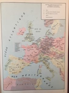
The map I analyzed of the Conservatories, Festivals, and Opera Houses in Western Europe demonstrated the pros and cons that a 2-D non interactive map had.

Map of Conservatories, Opera Houses, and Festivals in Western Europe from Atlas Historique de la Musique
Some of the strengths of the map was that it did categorize (by color and shape) and acknowledge all the festivals, opera houses, and conservatories within Western Europe and identified the names of each one. It also gives a map of the different countries (in big lettering) of Western Europe. It is important to note that this map was taken from Atlas Historique de la Musique, which is a book that is in French and it is possible that research utilized for this map was most likely from a majority of french sources. However, it does have flaws that make it a map that is hard to define certain relationships of the story it is trying to present. For example, all (the ones the map creator chose to incorporate) the conservatories, festivals, and operas are placed on one page. This can be problematic for some readers of this map because it does not categorize the points by year or even what the time period frame. There are also so many points on the map that it looks clustered and become overwhelming to the reader.
When creating the Travels of DuFay and Josquin Google Map, I realized that technology is a huge component in making maps more accessible and easily understandable for the general audience. There are so many tools on Google Maps such as color coating, sequencing, mapping areas, sorting through time periods and more that allow the reader to understand a story without the overwhelmingness of information presented. When creating the points on the map it was quite easy to first create my Josquin Spreadsheet of not only the city and country but other important columns of information for my topic and then import it into Google Maps to quickly make a map. From that basic tool, I am able to save myself time manually pinpointing each city in each country on the map and focus on categorizing. With the technology of Google Maps, I am also able to categorize by year and sequence it in order to show the starting and ending points of his travels. This creates a pathway for those to understand and grasp information little by little interactively in comparison to the 2-D map I analyzed which planted all the information on one single page. Yet, I did learn that being a map maker is very difficult especially when choosing what information to incorporate. When researching Josquin on Grove, I discovered that it was very hard to distinguish where and when Josquin traveled because certain sources in the information of Grove, would say one thing and another would say something different. After reading all the information, I had to make a judgement call on which information was valid to include on the map based on the sources provided on Grove. It was quite surprising that my partner Stella on this project, had no problem finding information for DuFay since he had more valid information she could easily document.
It was interesting reading the articles designated for class discussion because it revealed that maps are not objective and will always have some sort of bias. Map creators will always amplify or omit certain things on a map based on the resources they have and the story they want to tell with their map. It is common for a, the creators of these images to “play with maps” to present a certain argument or point. It also draws to down to ethics and politics as well because of the knowledge a creator of a map bears. For example when talking about Tibet in class, one student had discussed always seeing Tibet as its own country while another talked about seeing it as a part of China. This is because of the knowledge they were brought up in specifically with maps. The student who believed Tibet was its own country based her information on a map she had seen and the same was with the other student.. The map maker will have a power presenting information that we believe objective. Nowviskie in her article “How to play with Maps” from Cultural Mapping and the Digital Sphere: Place and Space states that society is “coming to expect to be able to sort digital search results spatially and to access historical and real-time location information for a wide variety of data” (109). We have become so reliant on technology and the information it presents that we believe as “objective”. It just proves that maps are not always the full ideas of information and that they will carry some bias regardless of the map maker.
You must be logged in to post a comment.