After a six month hiatus, I have returned to the world of Musical Geography in Dr. Epstein’s Undergraduate Research Course aptly titled “Musical Geographies.” In this class, we have assembled people both old and new to the project; what exciting adventure awaits (not to quote a Willy Wonka Gobstoppers wrapper)! Now that I’m back in the habit, I shall regale you with the tale of my first lesson learned this semester: “approach your work with humility, rather than hubris.” When Dr. Epstein said this on the first day of class, I had no inkling that it would apply so well to my first map-making endeavor.
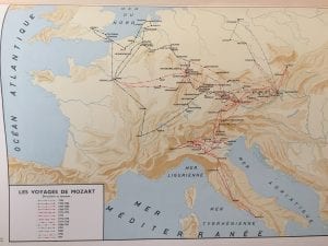
For our first assignment, we were asked to critique a map from a list of choices from Professor Epstein. I chose a map about “Mozart’s Travels,” shown here. Ruthlessly, I broke down minute details of this map in an attempt to prove that I could find problems in maps. The map, made in the 196 0’s, actually serves it’s purpose and doesn’t cause too much confusion.
However, I critiqued the map’s base layer, route notations, and lack of contextual information. While I thought that the map adequately shows the breadth of Mozart’s travels (he was a very active traveler, so the map is necessary to quickly identify Mozart’s travels in a way that writing them down could not convey). It also seems to be a very thorough examination, leaving little out.
While I’m glad that I addressed the strengths, my attention to the weaknesses overshadows all the kudos I originally gave. My critiques in my journal were as follows: “It is difficult to know if these routes are specific routes that Mozart took as a part of a tour, or if he took these merely to get from one commission to another and stayed at those places for a long period of time. For example, there’s a route from 1769-1771. Does this mean that Mozart was steadily travelling this route over those years, or did he travel it once to get from point A to point B and stay at point B, the end of the route, from 1769 to 1771. The colors of the routes, along with the small print, make it hard to follow. If it were digital, you could zoom in and the small font/clutter would be less of an issue. Perhaps adding in more colors would make it easier to follow. Each route could be a layer of the map that the user could hide or show, and then the dashed lines/weird arrows wouldn’t be necessary. Additionally, the routes could be more aptly named for the purpose of the journey or that phase of Mozart’s career, and each point at a city would have a pop-up explaining what Mozart did there and for what specific time period he stayed there.”
While this critique seems appropriate to me at the time, in performing our next task (creating a map ourselves) I ate my own words.
Katharina and I mapped the “Slave Song of the United States of America” that was cataloged in “Slave Songs of the United States,” a book published in 1867. The map we generated can be viewed below.
Our map contains many issues and caveats that render it just as flawed as the Mozart map. Firstly, we stick strictly to one source, so that means we can separate the polygons into the four sections of the book, but these sections appear to possess no pertinent rhyme or reason. Arbitrarily drawn, they could have been more helpful as state outlines or historical region names. Additionally, we added little as far as media and sound, and thus failed to make our map into a true “thick map.” As if these issues weren’t monumental enough, we completely neglected to contextualize our map to bridge the gap between us and the humanists who complain that the digital humanities ignores the complexity of place.
Even though I am proud of the map thus far, I see so many problems with it. I admit these problems. I helped make this map, and I take responsibility to not only acknowledge these issues but to help fix them as well. I approached this work with the confidence that last summer’s research gave me, but not the tenacity needed to tediously create a map any better than those I have so heavily critiqued. In this experience, I discovered my “great epic-hero’s flaw,” one that I never thought I would encounter. My hubris led to me hypocritically criticizing a perfectly adequate map whilst refusing to learn from my own criticisms to make my own maps better. Our self-importance blinds us. Pride, egotism, and arrogance make us imperceptive of our own faults and make us overly critical of the faults of others. This Greek tragedy-esque lesson (while far less dramatic) has taught me that in the future, I hope to approach my critiques and map-making with humility, rather than hubris.
For further reading:
William Francis Allen, Charles Pickard Ware, and Lucy McKim Garrison, “Slave Songs of the United States” A Simpson & co (New York: 1867). Published electronically by Robin Roenker (University of North Carolina: 2000). http://docsouth.unc.edu/church/allen/allen.html#slsong94
David J. Bodenhamer, “The Spatial Humanities: Space, Time, and Place in the New Digital Age,” in History in the Digital Age, ed. Toni Weller (New York: Routledge, 2013), 23-38.
Daniel Allington, Sarah Brouillette, David Golumbia, “Neoliberal Tools (and Archives): A Political History of Digital Humanities,” LA Review of Books (May 1, 2016).
Amardeep Singh, “In Defense of Digital Tools (by a non-tool),” www.electrostani.com (May 2, 2016).
You must be logged in to post a comment.