We worked in ArcGIS, GoogleMaps, and Carto to display simple pin-drop maps, heat maps, chronological maps, and cluster maps. In some cases, these may be combined to provide the benefits of both styles. Though our some 2,900 cataloged performances of the Ballets Russes may provide new insights, only some representations can show what we would like to argue. Thus enters the bias of mapping; regardless of if the map is intended to make an argument, it already does this on its own. As we choose what data is displayed and what kind of map communicates the data, we create a specific interactive world that will influence the user.
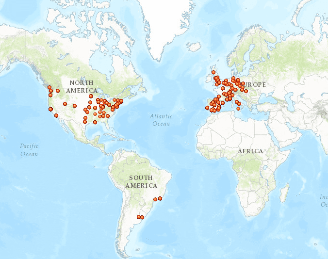
Ballets Russes pin drop map made in ArcGIS
For example, if we displayed the data in a simple, pin-drop map, it would show that the Ballets Russes had considerable performance experience across the Americas and Western Europe. Therefore, it would appear that their influence stretched to at least two of the four corners of the globe. This type of map will be more useful once performances of the Ballet Suédois and Soirees de Paris are also cataloged because it will be easier to compare the geographical spread of the companies’ tours and appointments. However, with only one layer of data, the map misleads the user. By looking at this map, someone could conclude that they maintained a strong presence and influence in America and Europe (simply based on the number of pin drops). However, the Ballets Russes toured America once, through 1916 and 1917, and not at all in the 1920’s. The simple pin drop map accurately shows the geographical breadth of their influence, but not the depth. In order to create maps about their influence more accurately than the one above, we must utilize thick mapping that incorporates time, space, media, and context.
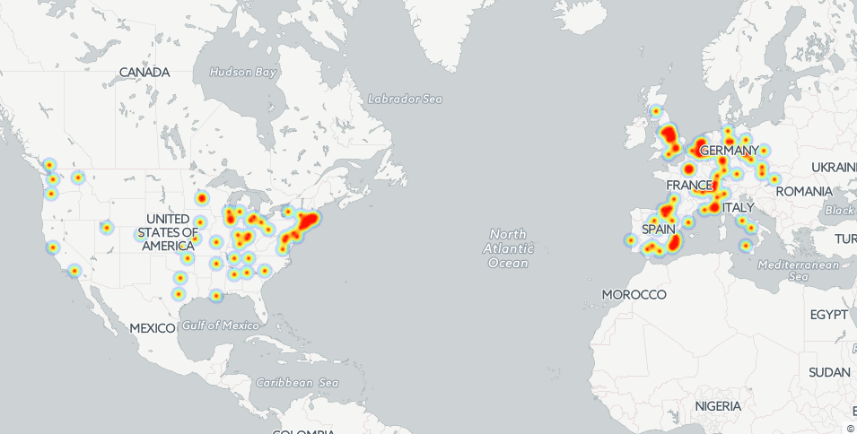 ArcGIS also struggled to map information with special characters and loaded slowly, so we turned to Carto and Google maps to see what they could offer. A map like the one we made in Carto shows the frequency of performances and more accurately depicts the places where the Ballets Russes created an image of high Parisian art (London and Monte Carlo). This map shows where they performed the most, and some locations fall off the grid because the Ballets Russes performed there a scarce number of times. If current scholarship about the company’s prestige is correct, this heat map directly aligns with views that they were revered and lauded in London and Monte Carlo more than they were in Paris. Londoners, tired of the cold, wet winters took one look at newspapers and craved the elite, warm life of the famous Ballets Russes while they performed in Monte Carlo. What took some scholars entire articles to argue is shown here in seconds. Especially since primary source documents, like newspapers and other media, may be embedded into the map. Someone can merely click on a see the heat map, read the linked London newspaper headlines, and place themselves in the life of a cold Londoner longing for the life of the high-class Parisian socialites vacationing in Monaco.

Ballets Russes heat map made in Carto. The time slider is available to give the user control over the time lapse.
The next map that tells a story is the time-sensitive/chronological map. The chronological map takes the user through an interactive geographical journey of the Ballets Russes, including program and venue information. We have made maps such as these in GoogleMaps, ArcGIS, and Carto. Anyone who engages with these maps can learn about the intense life of the dancers employed by Diaghilev. They performed nearly every night, and in some cases twice a day when on tour, and were often asked to perform pieces that had not been on the program in years. Le sacre du printemps by Igor Stravinsky, for example, appears on the program of a June 28, 1924 performance at the Théâtre des Champs-Élysées, and four years later reappears on the program of a May 23 1928 performance at the Théâtre de la Monnaie. All of this information is available on “The Musical Geography of 1920s Paris” website and searchable in the data used to make the maps (also available to the public). The dancers performed so often and likely wouldn’t have had much time to suddenly re-learn an old piece; the extreme performance schedule and programs would no doubt have been taxing on the dancers and all involved with the productions. Through the chronological map, users may experience all of the aforementioned factors of the performances as much as is possible. The chronological factors, at least in Carto, may be applied to heat maps as well to combine the benefits of both mapping styles.
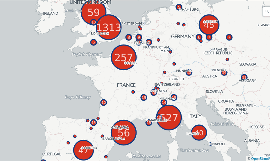
Ballets Russes Carto cluster map with the number of performances per city.
The final map we have explored is the cluster map created in Carto. While possibly possessing the most “shock” factor, this map accurately represents the number of performances in a given city. In a more direct way than the heat map above, this map shows that London and Monte Carlo boasted the more Ballets Russes performances than any other city, with 1,313 and 527, respectively. The immediate presentation of information inside the pins themselves adds presents the information immediately, up front. The performance information is still available, however, as are media attachments. Clearly, this map could argue that we should associate London with the Ballets Russes, not Paris; the latter, while considered the home base of the Ballets Russes, only hosted 257 documented performances. This map opens up new questions about the true influence of the Ballets Russes and who actually valued seeing the performances. The nature of our maps is not only to make new arguments, but to also ask more questions. As Frank notes, “The viewer expects the map to answer, not ask questions,” but this is hardly the case. Did Parisians only like laying claim to the Ballets Russes name, but not their performances? Was Garafola right in saying that the Ballets Russes never had as much influence in Paris as they did in London? This map would argue in her favor. It tells us that the perceived Parisian prestige of the Ballets Russes may not have been the case. Did Londoners invite the Ballets russes to their stages so often because they had ogled them in the newspapers? If so, does this mean their high social class and elitism actually brought them more prestige, rather than alienated them from the general public, as some scholars suggest? It appears that their higher social standing and glamorous image appealed to the public and the art scene, just not in Paris.
Each mapping style has benefits and drawbacks, and this also applies to the mapping platforms themselves. Carto catalogues all performances on top of each other and to see them all on the map one must manually move them all apart, and the same is true for GoogleMaps. However, those mapping platforms are much simpler to use than ArcGIS (which allows you to click through all the performances at a location). Carto creates Cluster maps like the one above, while ArcGIS does not. In order to make a map on ArcGIS, the creator must make all layers and uploads public every step of the way, otherwise only the creator can access it. To argue different points and make sure that our information is open-source, all of the mapping platforms are necessary.
In the end, we compiled all of the maps shown above in an ArcGIS StoryMap available to the public. Users may compare the maps made in ArcGIS, Carto, and Google Maps and decide the benefits and drawbacks from the consumer perspective. While mapping platforms like ArcGIS are more difficult to use in comparison to Carto or Google Maps, the researcher, educator, or member of the general public interacting with them without creating maps themselves may not notice a large difference. We encourage people to use our database and the data we have collected in order to create their own maps that may incorporate their own research as well. In this way, the practice of creating maps will become more commonplace.
You must be logged in to post a comment.