Google map so far has been a great rudimentary tool for us to create a descent map embodying our research works, meaning it presents a good amount of information and only requires basic computer skills. This also means, it has deficiencies in terms of effectively rendering all information and contains numerous manual works in order to compensate the technological easiness. In this blog post, I will put some data that I have collected so far into a google map and explore what can be continued or improved in future products.
The project I have been working on is researching performances of the Second Viennese School in Paris from 1905 to 1945, which is important for learning the tension between politics and music during this time period. For the past two weeks, I searched through Gallica, the digital archive database of the French National Library, and collected all information about performances of Arnold Schoenberg, Alban Berg and Anton Webern appeared on the newspaper Le Figaro in the time spectrum from 1905 to 1945. In order to make a google map, all data should be collected into multiple spreadsheets corresponding to each layer of the map. Below is one example.
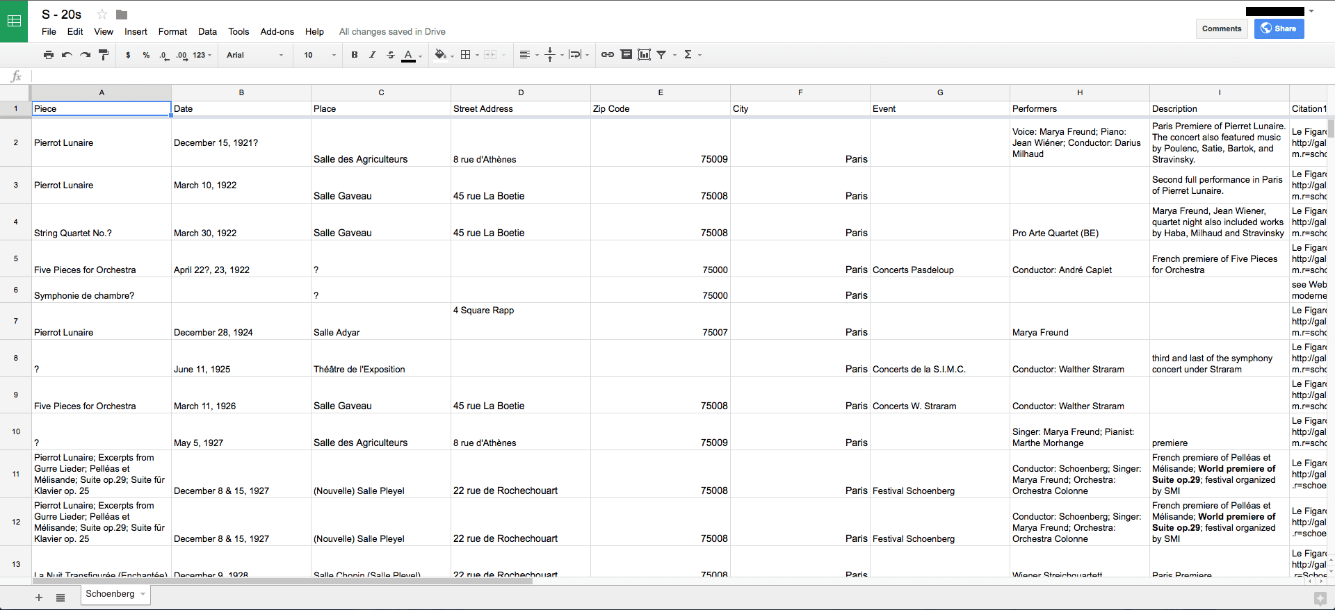
As it is shown in the spreadsheet screenshot, these entries still need refinement in order to provide more accurate information. For the moment, all unknown places of performances are assigned a zip code 75000 in order to be located on the map.
A google map is made by importing these spreadsheets to map layers.
In this map, each layer contains performances of a certain composer during a certain decade; every composer is assigned with an individual color, and every time period has a unique marker shape. For instance, performances of Schoenberg during the teens appears on the map as red round pins. By clicking on the icons, detailed information about the performance will appear; by clicking on and off the layers, performances of different composers in different time period can be compared. Other than various colors and shapes to choose, google map also features self-uploaded icons for markers, meaning pins on the map can also be small pictures of venues, composers, etc.
Although google maps do a good job in recognizing information contained in the spreadsheets, it is still not “smart” enough to fulfill some specific requests in presentation, which causes some “stupid” extra manual works. First of all, as you may have noticed, at each performance venue only one icon of the same shape can be shown because of overlapping, regardless multiple entries are located at this place. This deficiency largely reduces the visual effect of having a great number of entries appeared on the map, which is especially troublesome in such project where the amount of performances really matters. One way to resolve this problem is to zoom in to the venue and manually move the markers apart, which is quite inefficient and arbitrary. More professional mapping tools such as ArcGIS automatically avoid this problem. Another problem specifically related to the topic of music history is that google map does not have chronological feature. For the moment, in order to compare performances took place in different time period, users have to manually check on and off every layer, yet time-lapse inside each decade cannot be shown. An ideal map would contain a time-lapse interface that visualizes the chronology of performances and allows users to interact with it.
My next step of this research is to first all refine the data, using biographies and other archival journals. It is also necessary to take information outside concert performances into consider, such as radio broadcasts and musical reviews that mentioned the Second Viennese School, which is crucial for depicting a more comprehensive image of the Parisian reception to the Second Viennese School during this time period. This first try of google map will definitely become a primary standard as I am looking for more effective platform to present my observations.
You must be logged in to post a comment.