London Performances of Music by the Second Viennese School: 1912 – 1936

by | May 19, 2017

Abstract
Studying the reception of foreign music has always been an attractive task, especially one focusing on the turmoil age of early 20th century Europe. Musicologists have long been doing reception studies of the Second Viennese School, yet few have specifically connected musical geography with this particularly interesting subject.  Following up my mapping project from last summer, this semester I made a comparative map series of concert performances of the Second Viennese School in London. Adding a geographical layer onto the chronologically recorded history, these interactive digital maps contribute new dynamics and discoveries to the musical dissemination of the Second Viennese School.
Methodology
Musicologist Jennifer Doctor included a catalogue of British performances of the Second Viennese School music before WWII in her book The BBC and Ultra-Modern Music, 1922 – 1936: Shaping a Nation’s Tastes, where a comprehensive collection of concert performances and radio productions were listed in chronological order. Transcribing Doctor’s scholarship into a digital format, I mapped out the London concert performances of the Second Viennese School on various mapping templates of ArcGIS and ArcGIS Story Maps in order to explore innovative insights to this data set. In accompany with Doctor’s catalogue, I referred to Lewis and Susan Foreman’s London: A Musical Gazetteer and Nigeol Simeone’s Paris: A Musical Gazetteer to find detailed addresses and brief historical reviews of questioned concert venues.
Overview Basic Map

This basic ArcGIS map functions as an overview of all concert performances took place in London before WWII.

How to use: To use the map, click on the color-coded pinpoint to see detailed performance about each performance in the pop-up window. The map is layered by name of composer and the legend of the color coding is on the right side. Shade of the pinpoint illustrate if multiple performances by different composers took place at a certain venue. Check on and off the layers using in the layer window to view each layer individually.
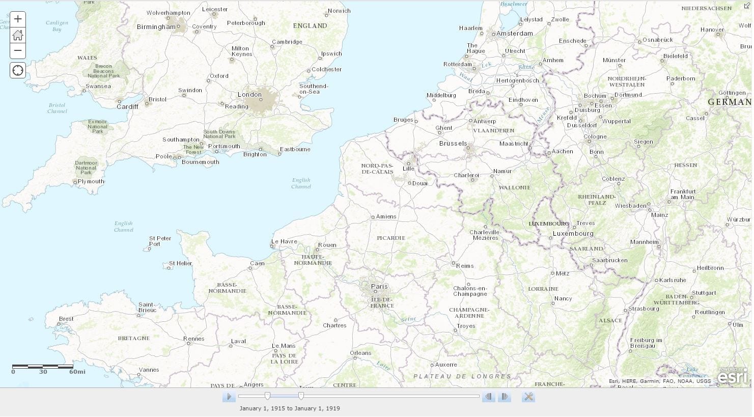
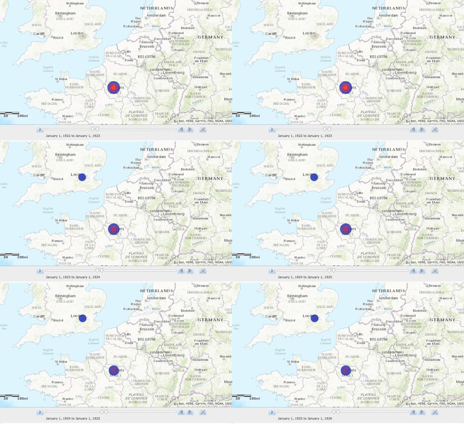
Comparative Time Lapse Map Incorporating time with geography, this time lapse map provides a synchornic comparison between the frequency of performance between London and Paris using heat map effect. How to use: Click on the play button to see the animated heat map and the pause button to view a freeze caption. Adjust the time unit (default is one year) of animation by dragging the two arrows on the timeline.
The synchronic juxtaposition between London and Paris provides special insights to a comparative reception study of music by the Second Viennese School during this time period. The either similar or distinctive frequency of concert performance took place each year in the two cities potentially speaks about a more general historical and musical context. For instance, during the years of WWI, neither London nor Paris had a single concert performance of music by the Second Viennese School. The coincident extinction of performances of the music written on the enemy side reaveals the political tension infiltrating musical activities during war time. 
The synchornic animation also narrates the flow of msical dissemnation across the English Channel. For instance, Arnold Schoenberg’s Pierrot Lunaire had its French premiere in Paris in 1922, conducted by Darius Milhaud. The follwing year, Milhaud’s performance group group traveled to London and performed Pierrot Lunaire‘s British premiere. Visulizing this event on the map, we can almost see this trend of Second Viennese School flows across the English Channel from Paris to London in two years from 1922 – 1924, under the effect of the popular Pierrot Lunaire.
Explorative Venue Map An exploration of a media rich template, this ArcGIS Crowdsource story map aims to provide an immersive learning experience of the concert venues where performances of works by the Second Viennese School were hosted. How to use: Click on the Thumbnail on the right side to see detailed introduction about each concert venue. Zoom in the map to see specific location of the venues and their geographical relations to each other.
In contrast to the previous time lapse map, this venue map tells a different, if not opposite, story about the reception of the Second Viennese School in London and Paris. The time lapse map seems to suggest a more welcoming situation in London, as the heat map frequently shows a noticeably higher number of performances took place in London than Paris over the same time period. However, this venue map tells us that the number of concert venues hosting those performances were not as much different between the two cities. In this case, music by the Second Viennese School arguably may have been a less popular program in London, since the number of venues invovled was very concentrated in relate to the total number of performance. In fact, several of the London venues are geographically right next to each other: the two major venues where works by the Second Viennese School were performed – Queen’s Hall and the concert hall of BBC Broadcasting House – are almost right across the street to each other. On the contrary, although Paris had less number of performances than London, the concert venues were farily spread out around those traditionally artistic neighborhoods. 
About the crowdsource beta feature of ArcGIS: Since the Crowdsource map is still a beta feature on ArcGIS Story Map, it is worth listing out some pros and cons of this mapping template that may be helpful for other musical geographers.

+

Media rich
Crowsource allows you to add one picture (no smaller than 700p) for each pinpoint and an introductory text less than 200 words.
Visualization

Cartography of this template is one of the most effective and visually appealing ones among all ArcGIS and ArcGIS story maps. Especially the counting fucntion and expanding feature are unique effects that no other ArcGIS maps are currently doing.

Size of Data
This mapping template is suitable only for small dataset. At least currently, the template requires you to add entries manually and does not pffer an option to import spreadsheet into the template.
Unlayered
Currently this template restore all your data onto one featured layer, and does not visually differentiate multiple layers.