Project Overview
My colleagues and I want to change the way you think about music using Musical Geography. But what exactly is Musical Geography? As we understand it, Music Geography is the exploration of the intersection of time, space, and sound using mapping technology.
This summer, we will be working to examine music in a spatial and historical context by making a series of maps. Our specific focus is on the French composer Darius Milhaud. We will be making four maps to help answer questions about his life:
- A map of his travels.
- A map of the critical reception of his works.
- A map of the premieres of his music.
- A map of the stylistic influences that can be found in his work.
In addition, each of us will be pursuing an individual project related to music history, the digital humanities, and mapping.
Methodology
But why maps? What makes maps our method of choice for displaying data?
Our reasoning is twofold. We want to both explore mapping technology as a part of the digital humanities and as a pedagogical resource and to have a new way of viewing musical information that prompts us to ask unique questions that you could only ask after you’ve seen a map. Mapping information allows scholars to creatively engage with their data in new ways. So how exactly are we going to make all these maps? The mapping process has two major steps:
- Drawing information from primary and secondary sources to inform spreadsheets of data.
- Putting the data from those spreadsheets into a mapping platform like Arc GIS or Google Maps to generate interactive maps.
The goal of generating these maps is to help explore different facets of our data sets and examine our data for any trends that may appear.
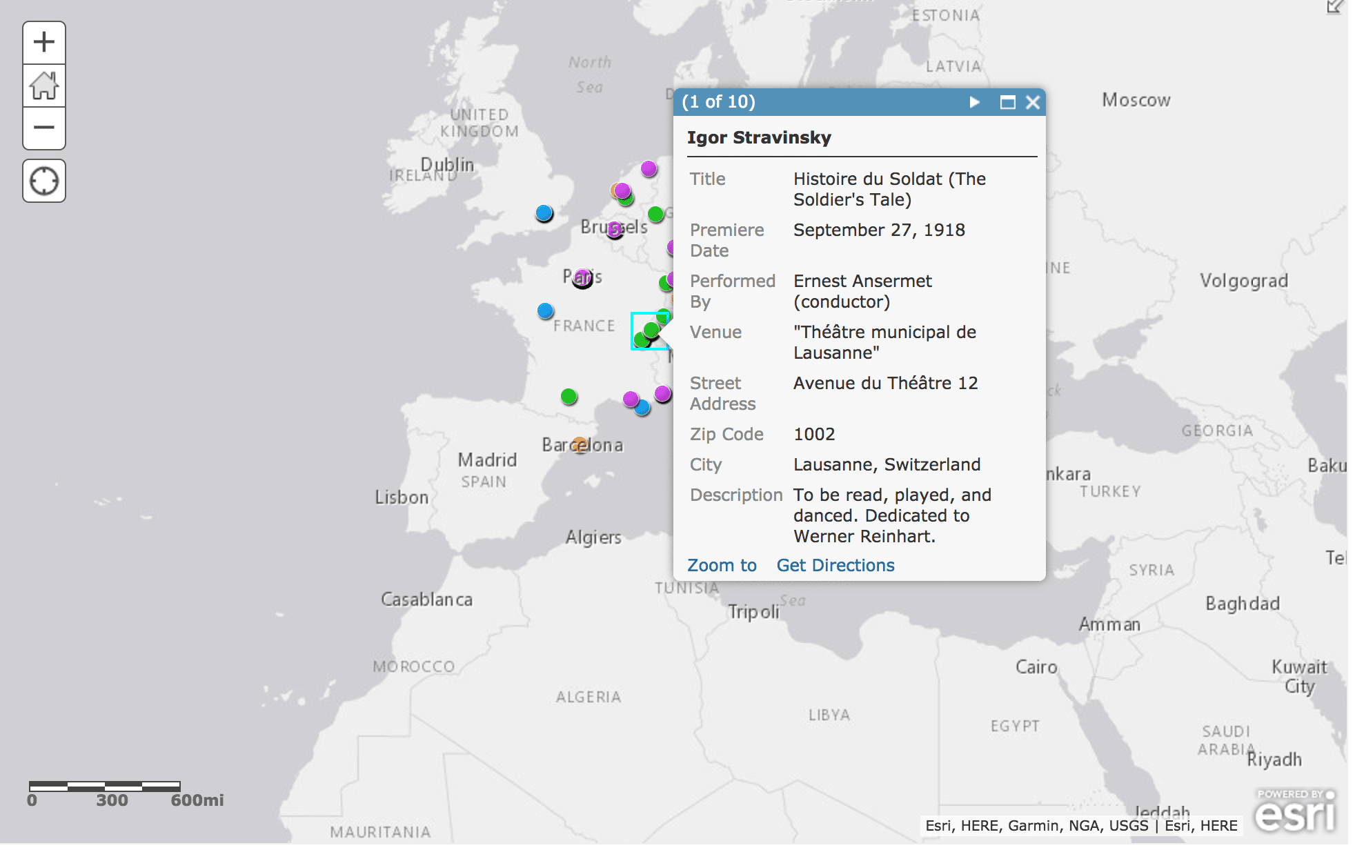
Figure 1.
Our Work So Far
We’ve already begun creating maps. To date, we have made a map of Parisian landmarks (that can be found in an earlier blog post), and a map of the premieres of Stravinsky, Poulenc, Honegger, and Milhaud between 1910 and 1933. Figure 1 demonstrates the amount of data that can be gleaned from our maps. Each point represents the location of a premiere by a composer. When you click on the point, a pop-up window appears containing the piece title, premiere date, performing forces, venue, and a brief description of the work. Figure 2 illustrates the worldwide view of the map. Seeing our data displayed in this map prompted us to ask new questions: why did Milhaud have a premiere in Rio de Janeiro? Who did he know there? Did premiering one of his works in Brazil contribute to stylistic influences in his later works? These questions become clear when seeing our data displayed on a map.
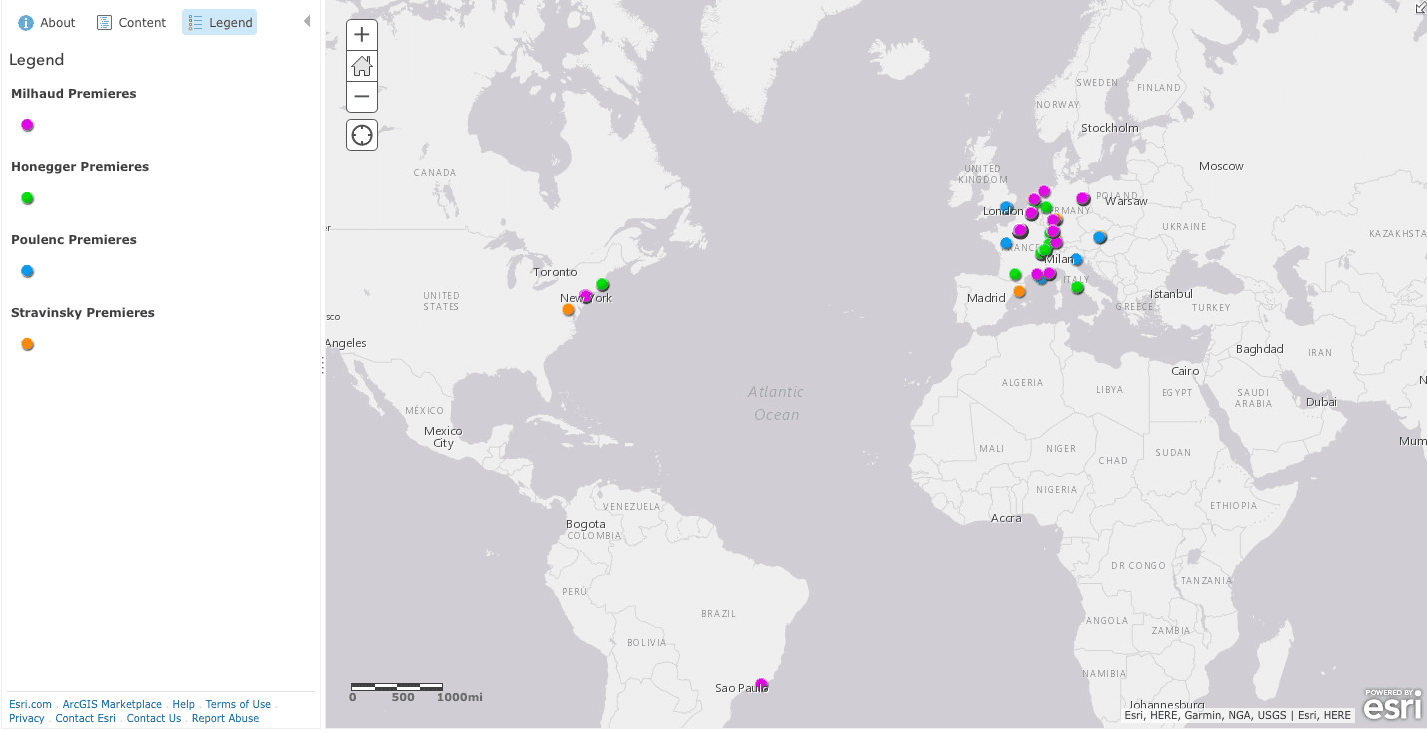
Figure 2.
Why does this matter?
This summer we hope to use our mapping technology to create a comprehensive database of the premieres of Darius Milhaud that can be used as a tool by our fellow musicologists. We also hope to create maps that can be used as pedagogical tools for scholars, to be used in the classroom or in undergraduate and graduate level research. This work will allow us to explore new areas of scholarship within the Digital Humanities. Our goals, however, are not just aimed at musicologists. Mapping technology allows us to experiment with new visualizations of data that we can use to make unique and creative arguments. In creating maps to examine music in a spatial context, we can make music history more accessible to those outside the academic sphere. Playing with an interactive map is certainly more entertaining than thumbing through a four hundred page biography.
Musical Geography is pushing the boundaries of how musicologists understand music. And hopefully, with a little time and some well-formatted data sets, we can change the way you think about music, too.
You must be logged in to post a comment.