Since my last blog post, I have started visualizing my research data by transcribing them from catalogue entries to mapping points. A major source for my research, Jennifer Doctor’s monograph The BBC and Ultra-Modern Music, 1922-1936: Shaping a Nation’s Tastes, contains a chronological collection of all British performances of the Second Viennese School’s works between 1912 and 1936. Starting from here, I transcribed the first 20 entries in the catalogue into a spreadsheet, which I then imported into an ArcGIS map.
Catalogue → Spreadsheet: reorganize the information
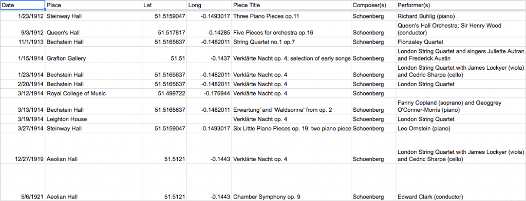
A screenshot of my spread sheet in progress
Transferring information from catalogue to spreadsheet is a necessary preparation for the visualization. Though seemingly trivial, this process in fact inspires many valuable observations that are helpful in the later part of the research. Rearranging the information enables us to statistically analyze data, such as vertical comparison inside a single class of information and other numerical calculations. For instance, from transforming the first 20 entries into the spreadsheet, I gained a basic statistical overview of this set of data that was comparable with my old data of Parisian performances. The London performances were already more frequent than the Parisian ones just within the beginning years, and the concert venues were more diverse.
Spreadsheet → Map: enrich the data through visualization
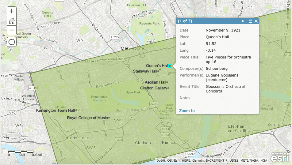
An ArcGIS rendering of the data
Importing the spreadsheet into ArcGIS, I got a rudimentary view of all the data points mapped out in their corresponding geographical locations. I also imported my old data sheet of Paris into the same map in order to make the comparison more visible. As it turned out, although in London more performances took place and more diverse venues involved, the performances were still to a large extent concentrated in a limited region, not unlike the situation in Paris. In other words, although from the basic statistical counting we may tend to argue that London had a more active musical engagement with the Second Viennese School’s works, the map functioned as an ineligible counter argument that qualified the previous observation concluded without the geographical references.
Map → Catalogue: gain and loss
Comparing the map with the original catalogue, I find both gain and loss in the transcription of information. Foremost, the advantage of map is very perceivable: it enriches the meaning of the data collection by adding a new geographical dimension to it. However, it is also important for us to notice the deficiency of map compared with catalogue. As it is usually utilized in traditional research, catalogue functions as a place where readers can find individual pieces of information, i.e. a piece title in a specific performance happened on a specific date. In maps, such individuality of each piece of information was reduced, while maps have a stronger collective rendering of information, possibly due to spreadsheets’ nature of categorization and grouping. Therefore, to compensate such deficiency, adding analytical and interactive functions such as time lapse bar and finder tool will help make the map more useful for both research and learning purposes.
You must be logged in to post a comment.