From now on, rule number one is “no shortcuts.” No more trying to do the same work with less effort, no more ending up with a lower quality product. Maybe shortcuts work for some people, but they don’t work for me! Especially not the ones inspired by my hubris as a programmer. I can still hear the deceitful voice of my subconscious whispering in my ear: Don’t enter those records by hand… Write a program that will do it for you… And here I am, two weeks later, with a hundred performances of Ravel’s Boléro sans program information, all because the data I tried to scrape off the BSO and NY Philharmonic websites were full of extra spaces, extra parentheses, and misspelled words. To make matters worse, my “time-saving program” failed to record the first piece on each BSO program.
Finding performance data for Ravel’s Boléro hasn’t been hard. The Internet is overflowing with digitized orchestra programs, and French periodicals available on Gallica supply information about performances in France. Apart from my initial refusal to enter data by hand, I have so far encountered only two main challenges: finding performance information from other European countries, and deciding how to represent my data on maps.
Thanks to a digital collection called Europeana, the first 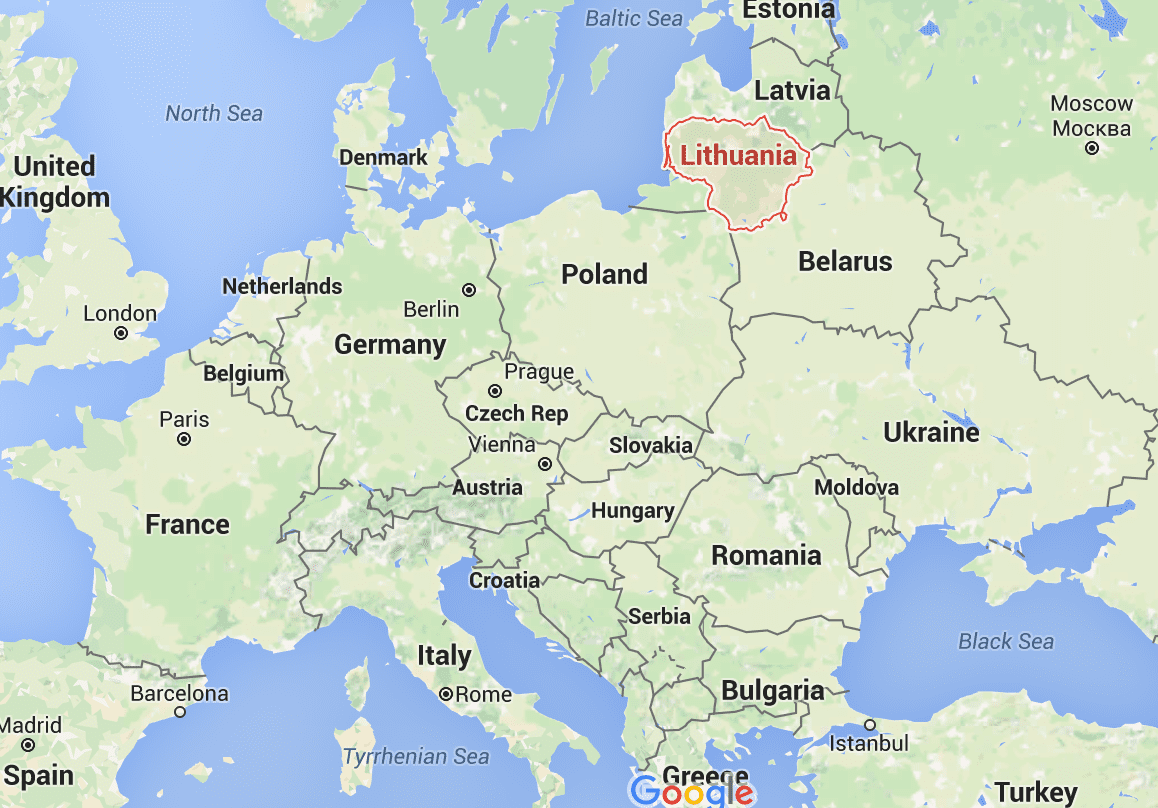 challenge hasn’t posed too great a difficulty. When I search Europeana for texts matching
  “Boléro”, the first result is a concert program from the State Theater in Lithuania, at which the piece was performed in 1932. Upon finding this program, my first thought was, where is Lithuania? I looked it up and discovered that it’s far to the east of France. In that case, was Boléro also performed in Poland? Belarus? Ukraine? With the knowledge that the piece spread quickly to both the east and the west, I can search for performances in specific countries.
The second challenge — mapping — applies to each of our projects. In my last blog post, “Bringing our Data to Life“, I summarized several of our ideas for mapping our data. Since Boléro was so widespread, one idea from that post that seems particularly relevant is publishing multiple maps side-by-side in order to compare the piece’s spread throughout different countries. Chronology will be important, so ArcGIS Story Maps might be a good place to start. This project is unique because it involves one specific piece. The piece is 17 minutes long, but I want to find a way present the data I collect with Boléro itself as the background. It could resemble a screencast, but with a recording of the piece as the sole audio. I could imaging starting with Ravel’s composition of the piece, moving on to its first performance as a ballet with Ida Rubinstein as lead gypsy, following up with its spread through France and the rest of the West, and ending five years later in 1933. It would also be fun to show Boléro‘s performances on one map, while simultaneously displaying performances of another significant work, or the travels of key institutions/orchestras, in a second map. Ultimately, our goal is that people will be able to easily make their own maps, both by downloading relevant data as a CSV file and by using the Google Maps Javascript API to instantly plot results on our website.
To finding data, entering it by hand, and making awesome maps!
You must be logged in to post a comment.